New Features in FlexGrid for ASP.NET Core MVC
Customize Cells, Pin Columns, Select Rows with Checkboxes, and More
In the latest release of ComponentOne ASP.NET MVC Core Edition, many new features and improvements have been added. In this blog, we will look at the new features that have been added to the FlexGrid control.
Customize Cells Using CellMaker
In the 2020v1 release, we added Template and TemplateFunction properties to the Column class. These properties let users easily format the text inside the cells of a particular column. We also added a new CellMaker module that simplifies the process of creating custom cell content and templates such as buttons, hyperlinks, and more.
CellMaker makes it easy for users to create frequently used templates in the FlexGrid. CellMaker also returns a TemplateFunction in the column.
The following function takes the reference of the CellMaker object, uses the makeButton method of CellMaker, and returns a template function that creates a button on each cell in the column.
The TemplateColumn property is assigned to this function:
function createButton(CellMaker) {
 return CellMaker.makeButton({
 text: '<b>${item.Country}</b> Button',
 click: function (e, ctx) {
 alert('Clicked Button ** ' + ctx.item.Country + ' **');
 }
 });
}

<c1-flex-grid id="customCellFlexGrid" auto-generate-columns="false" is-read-only="false" class="grid">  ...
<c1-flex-grid-column binding="Country" header="CellMaker Button" width="150" align="center" template function="createButton"></c1-flex-grid-column>
 <c1-items-source read-action-url="@Url.Action("CustomCells_Bind")"></c1-items-source> </c1-flex-grid>
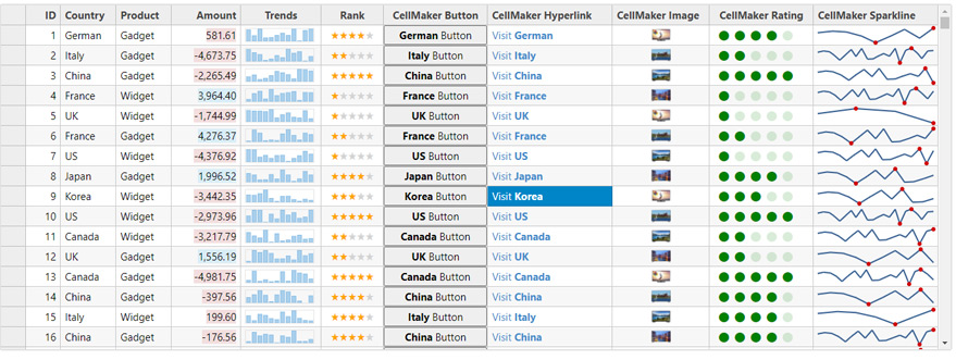
CellMaker provides a function that creates the following type of cells:
- Button
- Hyperlinks
- Images
- Sparklines
- Ratings
Visit the Custom Cells sample for a detailed demonstration.
Pinning Column Range with the PinningType Property
In the previous versions, we added an AllowPinning property. It lets users freeze columns with a single click. In this version, we added the PinningType property that pins a whole range of columns. This property takes a value of C1.Web.Mvc.Grid, PinningType enum.
Set the value of this property to PinningType.ColumnRange, click on the pin element of any two columns, and freeze all the columns between them. Along with this property, we also added OnClientPinningColumn and OnClientPinnedColumn events. These events fire before and after the columns are pinned respectively.
<script type="text/javascript">
 function onPinningColumn(s, e) {
 alert('pinning column');
 }
 function onPinnedColumn(s, e) {
 alert('pinned column');
 }
</script>
<c1-flex-grid id="ovFlexGrid" auto-generate-columns="true" class="grid" is-read-only="true" width="900px" pinning type="ColumnRange" pinning-column="onPinningColumn" pinned-column="onPinnedColumn">
 <c1-items-source read-action-url="@Url.Action("ColumnPinning_Bind")" query-data="collectingQueryData"></c1- items-source>
</c1-flex-grid>
To use the original functionality of the AllowPinning property, set the value to PinningType.SingleColumn.
To prevent pinning, set the value to PinningType.None.
Visit the Column Pinning demo for more information.
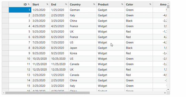
Customize DataMaps using DataMapEditors
The latest version of FlexGrid includes a DataMapEditor property.
When a DataMap is added to a column, a ComboBox like drop-down is displayed and used for editing the values. Use the DataMapEditor property to change the editor of DataMap so it behaves like a simple drop-down list, a textbox with an autocomplete feature, or radio buttons for all the values.
This property takes a value of DataMapEditor enum.
The default value is DataMapEditor.DropDownList.
<c1-flex-grid id="ovFlexGrid" auto-generate-columns="false" class="grid" is-read-only="false">  <c1-flex-grid-column binding="ID" is-visible="false"></c1-flex-grid-column>
 <c1-flex-grid-column binding="Start" format="MMM d yy"></c1-flex-grid-column>
 <c1-flex-grid-column binding="Country" datamap-editor="@C1.Web.Mvc.Grid.DataMapEditor.AutoComplete">  <c1-data-map display-member-path="Name" selected-value-path="Name" sort-by-display-values="true">  <c1-items-source source-collection="countries"></c1-items-source>
 </c1-data-map>
 </c1-flex-grid-column> <c1-flex-grid-column binding="Amount" format="c"></c1-flex-grid-column>  <c1-flex-grid-column binding="Rank" width="250" align="center" datamap-editor="@C1.Web.Mvc.Grid.DataMapEditor. RadioButtons">
 <c1-data-map display-member-path="Name" selected-value-path="Name" sort-by-display-values="true">  <c1-items-source source-collection="ranks"></c1-items-source>
 </c1-data-map>
 </c1-flex-grid-column>
 <c1-items-source read-action-url="RemoteBindCustomerSale_Read" update-action-url="ProductsUpdate"></c1-items source>
</c1-flex-grid>
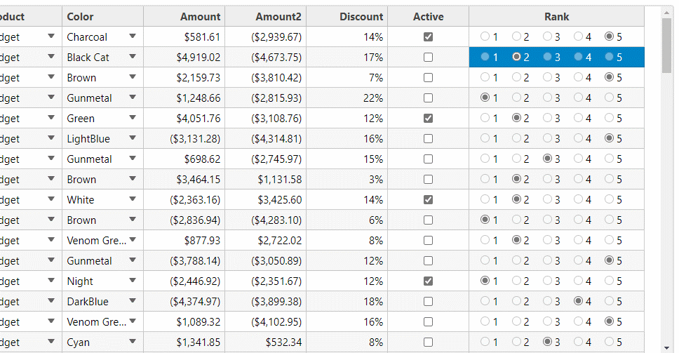
Notice the radio buttons added to the Rank column.
Visit the DataMap page for the demo.
Create Custom Groups Using GroupDescriptionCreator
With previous versions of FlexGrid it was not possible to create custom groups.
This version features a GroupDescriptionCreator property. This property uses a function that takes the current property as a parameter on which the grouping is performed and returns an instance of PropertyGroupDescription class.
<script type="text/javascript">
 var europe = ["UK", "France", "German", "Italy"], american = ["US", "Canada"], asian =  ["Japan", "China", "Korea"], autralian = ["Australia"];
 function customGroup(prop) {
 switch (prop) {
 case 'Start':
 case 'End':
 return new wijmo.collections.PropertyGroupDescription(prop, function (item, prop){  return wijmo.Globalize.formatDate(item[prop], 'yyyy');
 });
 break;
 case 'Country':
 return new wijmo.collections.PropertyGroupDescription(prop, function (item, prop){  if (europe.indexOf(item.Country) > -1) {
 return "Europe";
 }
 else if (american.indexOf(item.Country) > -1) {
 return "American";
 }
 else if (asian.indexOf(item.Country) > -1) {
 return "Asian";
 } else {
 return "Australian";
 }
 });
 break;
 }
 }

</script>

<c1-flex-grid id="ovFlexGrid" auto-generate-columns="false" is-read-only="true" class="grid">  ....
 <c1-items-source read-action-url="@Url.Action("GroupPanel_Bind")"></c1-items-source>  <c1-flex-grid-group-panel placeholder="Drag columns here to create Groups" hide-grouped-columns="false" group description-creator="customGroup">
 </c1-flex-grid-group-panel>
</c1-flex-grid>
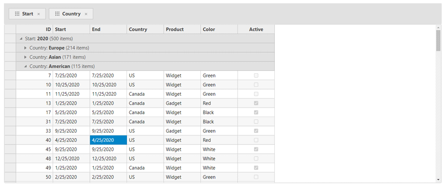
Observe the group names in the group header rows. The Start column is grouped by year and the Country column is grouped by continent.
Visit the GroupPanel page for a demo.
Select Rows Using a Selector and BooleanChecker
Using checkboxes to select rows is a common practice. In this version, a new Selector class adds checkboxes to the row headers automatically.
<c1-flex-grid id="@controlId" height="500px" is-read-only="true" auto-generate-columns="false" sorting-type=" None" group-by="ShipCountry,ShipCity" show-groups="true">
 <c1-items-source read-action-url="@Url.Action("CheckboxSelection_Bind")"></c1-items-source>  ....
 <c1-flex-grid-selector show-check-all="true"></c1-flex-grid-selector>
</c1-flex-grid>
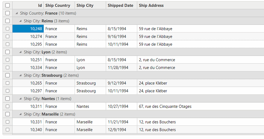
Use the ShowCheckAll property to set whether a select all checkbox is displayed in the column headers.
The new BooleanChecker class adds checkboxes for boolean type columns. It makes it easy to add a select all checkbox in the header that updates the value of each cell with a single click.
<c1-flex-grid id="@controlId" allow-add-new="true" allow-delete="true" auto-generate-columns="false" style=" height:500px" group-by="Country" show-groups="true">
 ...
 <c1-items-source read-action-url="@Url.Action("GridBooleanCheckerBind")" update-action-url="@Url.Action ("GridBooleanCheckerUpdate")">
 </c1-items-source>
 <c1-flex-grid-boolean-checker column="Active" show-check-all="true"></c1-flex-grid-boolean-checker> </c1-flex-grid>
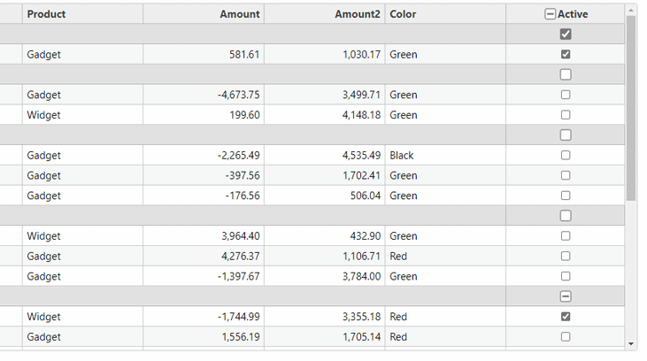
Visit the CheckBox Selection and Boolean Checker pages for detailed demos.
Easily Change Checkbox States with BigCheckboxes
For boolean type columns, FlexGrid adds checkboxes for updating the values automatically. But, the value is only updated when we click on the checkbox.
The latest version of FlexGrid includes a BigCheckboxes property which sets the whole cell as a checkbox.
It does not increase the size of the checkbox, but clicking anywhere on the cell will update the value. This makes it easier for the user to change the value of the boolean cell.
<c1-flex-grid id="ovFlexGrid" auto-generate-columns="false" class="grid" is-read-only="true" big-checkboxes="true" >
</c1-flex-grid>

Just click on the cell, and update the checkbox.
Add Custom Editors Easily by Using the New Editor Property
In the previous versions of FlexGrid, using input controls as grid editors, meant we used the column's cell template to create custom editors. FlexGrid v2021, includes a new Editor property.
This feature lets users assign input controls as column editors.
To use this option, create an input control outside the FlexGrid and set the id of the control as the value of editor property. FlexGrid automatically displays the editor and updates the bound values.
<c1-input-date id="dateEditor" style="width:100%" is-required="false" format="d"></c1-input-date>
<c1-flex-grid id="customGridEditorsGrid" allow-add-new="true" allow-delete="true" key-action-tab="Cycle" auto generate-columns="false">
 ...
 <c1-flex-grid-column binding="Start" header="Date" width="*" format="d" editor="dateEditor"></c1-flex-grid column>
 ...
</c1-flex-grid>

Visit the Custom Editors page for a complete demo. In this sample, Date, Country, and Color columns use the editor property.
Search Using the CaseSensitiveSearch Property
This release offers a new CaseSensitiveSearch. Use it with FlexGridSearch control to perform case sensitive searches.
<c1-flex-grid id="theFlexGrid" class="grid" is-read-only="true" auto-search="true" case-sensitive-search="true"> </c1-flex-grid>

This property works with the AutoSearch property. Visit the Searching page for a sample.
Copy/Paste Merged Cells Easily with ExpandSelectionOnCopyPaste Property
Another new feature is the ExpandSelectionOnCopyPaste property. When set to true, it automatically expands the selection to include cells in merged ranges when copying or pasting content to/from the clipboard.
<c1-flex-grid allow-merging="All" expand-selection-on-copy-paste="true"></c1-flex-grid>

Visit the Merge Cells page for the sample.
Preserve Spaces Using the PreserveWhiteSpace Property
FlexGrid’s latest version includes the new PreserverWhiteSpace property. If the value of this property is set to true, the extra white space in the data is displayed as is without trimming the space.
<c1-flex-grid id="ovFlexGrid" auto-generate-columns="false" class="grid" is-read-only="true" preserve-white space="true">
 ....
</c1-flex-grid>

Visit the Preserve White Space page for an online demo.
Display Transposed Data in Multiple Columns with the New TransposedMultirow Control
FlexGrid’s 2020v1 release includes a new TransposedGrid control in the ComponentOne MVC Core edition. The TransposedGrid interchanges the rows and columns of FlexGrid and displays the data in the transposed format.
This release features a new TransposedMultiRow control.
This control is a combination of FlexGrid, TransposedGrid, and MultiRow. It displays the data in a transposed format (like TransposedGrid) and in multiple columns (like MultiRow).
<c1-transposed-multi-row id="ovTransposedMultiRow" class="multirow">
 <c1-items-source source-collection="Model"></c1-items-source>
 <c1-transposed-multi-row-cell-group header="Order" colspan="2">
 <c1-transposed-multi-row-cell binding="Id" header="ID" class="id" width="150" />  <c1-transposed-multi-row-cell binding="Date" header="Ordered" width="150" />
 <c1-transposed-multi-row-cell binding="Amount" header="Amount" format="c" class="amount" />  <c1-transposed-multi-row-cell binding="ShippedDate" header="Shipped" />
 </c1-transposed-multi-row-cell-group>
 <c1-transposed-multi-row-cell-group header="Customer" colspan="3">
 <c1-transposed-multi-row-cell binding="Customer.Name" name="CustomerName" header="Customer" width="200" />  <c1-transposed-multi-row-cell binding="Customer.Email" name="CustomerEmail" header="Customer Email"  class="email" colspan="2" />
 <c1-transposed-multi-row-cell binding="Customer.Address" name="CustomerAddress" header="Address" />  <c1-transposed-multi-row-cell binding="Customer.City" name="CustomerCity" header="City" />  <c1-transposed-multi-row-cell binding="Customer.State" name="CustomerState" header="State" />  </c1-transposed-multi-row-cell-group>
</c1-transposed-multi-row>

You can download the sample from here
Conclusion
These were the key features that were added to FlexGrid in this release. However, this post does not provide an exhaustive list of minor bug fixes and features added to other controls.
Download ComponentOne Installer for MVC Core here.
You can find the complete list of demos of ComponentOne MVC Core edition from the link here.
For further reading, you may go through the changelog below: Release Notes

Ashwin Saxena