We have added some exciting new chart enhancements in SpreadJS v13! You can now do more with charts than ever before.
New charting enhancements include:
- Trendline
- Error Bars
- Logarithmic Axes
- Legend positioning and font customization
- Area Border
- Display Blank As
- Display Unit for Axis
- Hover Styles and animation
Now, let's discuss these features.
Trendline
Trendline is a useful feature to analyze past trends on data and widely used to analyze financial information.
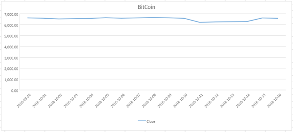
Let's suppose we want to analyze Bitcoin’s trend to make an informed decision for investment. Historical data pricing alone would not provide the full picture we need. But, using a Linear Trendline would give us a clearer picture.
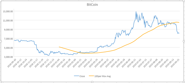
Now, let’s say we want to get an analytical view of the short-term, medium term, or long-term trend of Bitcoin. We can apply 10 Period, 50 Period, and 100 Period Moving average, respectively.
Here are some examples of Spreadsheet Charts where we have applied Trendlines and Moving Averages on Bitcoin historical data for last year.
Chart with 10 period moving average:
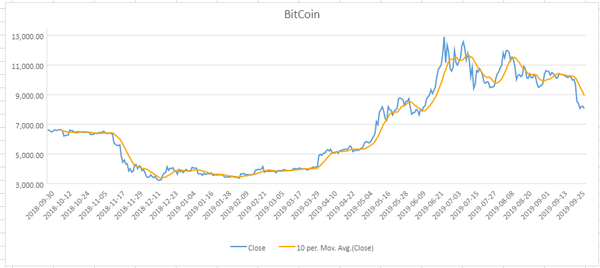
Chart with 50 period moving average:
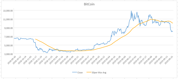
Chart with 100 period moving average:
Here’s the code that we can use to apply:
Moving Averages
//set trendline
function setTrendLine(chart,movingAveragePeriod,name) {
    let series = chart.series().get(0);
    let trendLine= {
        type: 3,
        period: movingAveragePeriod,
        style: {
            color: 'orange',
            width: 2,
            dashStyle:0
        },
        name:name
    };
    series.trendlines = [trendLine];
    chart.series().set(0, series);
}
setTrendLine(chart, movingAveragePeriod, sheet.name());
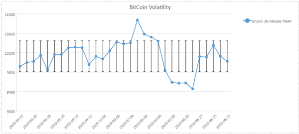
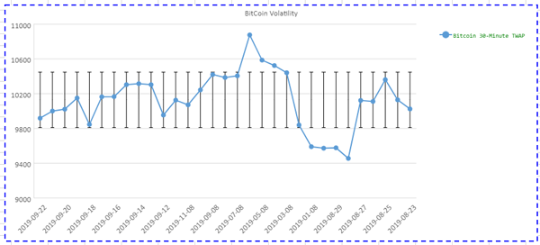
Error Bars
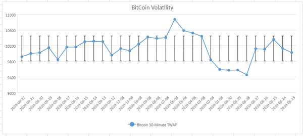
In Excel, Error Bars are used to denote the margin of errors and Standard Deviations. Error bars are shown on all the data points in the chart as a standard error amount, percentage, or Standard Deviation.
Since we are discussing Bitcoin Cryptocurrency, we can use Error Bars to display the 1 SD range for Bitcoin in the last 1 year.
Here’s the code that we can use to apply Error Bars:
//set error bars
function setErrorBars(chart,seriesIndex,valueType:number,value:number) {
    let series = chart.series().get(seriesIndex); series.errorBars = {
        vertical: {
            valueType: valueType,
            value: value
        }
    }
    chart.series().set(0, series);
}
// add Error Bars
setErrorBars(chart, 0, 3, 1.0);
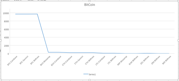
Logarithmic Axes
Logarithmic scaling of value axes is useful when we need compare the relative changes in the data series. For example,let’s say we would like to compare different Cryptocurrencies in the following table data:
| Symbol | Name | Price | Change | %Change | Volume | Previous |
| BTC-Bitstamp | Bitcoin/USD Bitstamp | 9692.1797 | 9.99 | 0.10% | 1513 | 9682.99 |
| BTC-Coinbase | Bitcoin/USD Coinbase | 9690.79 | -23.21 | -0.24% | 11717 | 9714 |
| BTC-Gemini | Bitcoin/USD Gemini | 9691.79 | -24.6699 | -0.25% | 2151 | 9716.46 |
| BTC-Bitfinex | Bitcoin/USD Bitfinex | 9707.0996 | -29.1006 | -0.30% | 6060 | 9736.2 |
| BCH-Bitstamp | Bitcoin Cash/USD Bitstamp | 288.4 | -6.29 | -2.13% | 6742 | 294.69 |
| BCH-Coinbase | Bitcoin Cash/USD Coinbase | 288.5 | -5.64 | -1.92% | 21108 | 294.14 |
| ETH-Coinbase | Ether/USD Coinbase | 195.49 | -6.45 | -3.19% | 110442 | 201.94 |
| ETH-Gemini | Ether/USD Gemini | 196.1 | -5.75 | -2.85% | 13567 | 201.85 |
| ETH-Bitfinex | Ether/USD Bitfinex | 196.01 | -6.16 | -3.05% | 99920 | 202.17 |
| LTC-Coinbase | Litecoin/USD Coinbase | 66.37 | -0.45 | -0.67% | 253008 | 66.82 |
| LTC-Bitfinex | Litecoin/USD Bitfinex | 66.501 | -0.384 | -0.57% | 161964 | 66.885 |
| XRP-Bitstamp | Ripple XRP/USD Bitstamp | 0.2674 | -0.0017 | -0.63% | 55815026 | 0.26908 |
| XLM-Bitfinex | Stellar Lumens/USD Bitfinex | 0.0634 | -0.0014 | -2.16% | 1888078 | 0.06475 |
| ZEC-Bitfinex | Zcash/USD Bitfinex | 44.271 | 0.165 | 0.37% | 6450 | 44.106 |
| ZRX-Bitfinex | Ox/USD Bitfinex | 0.2219 | 0.0119 | 5.67% | 2233766 | 0.21001 |
| BAT-Bitfinex | Basic Attention Token/USD Bitfinex | 0.1888 | 0.0019 | 1.02% | 14323 | 0.18694 |
| BTC-Bitfinex | Bitcoin/USD Bitfinex | 9707.0996 | -29.1006 | -0.30% | 6060 | 9736.2 |
Since each of these Cryptocurrencies have different prices, comparing them using a line chart with a standard value axis would not give the true picture of the relative difference.
If we converted the price axis to the logarithmic axis, the relative difference in price now gives the correct picture. Let’s look over the chart with the logarithmic axis:
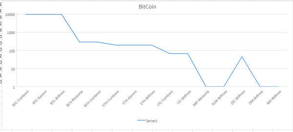
We need to add the following code to covert the price axis to a logarithmic axis.
//add logarithmic axis bars
function setLogarithmicAxis(chart,seriesIndex,valueType:number,value:number) {
    let axis = chart.axes();
    axis.primaryValue.scaling = {
        logBase: 10
    };
    chart.axes(axis);
}
//set logarithmic axis
setLogarithmicAxis(chart, 0, 3, 1.0);
Legend positioning and font customization
SpreadJS supports chart legends to let the user know what the series information represents. By default, the legend is shown at the bottom of the chart.
The legend can also be shown at the top-right, top, left, right, or bottom using the Legend Position Enumeration.
The following code sets the legend position at the top-right corner.
//set legend position
function setLegendPosition(chart) {
    let legend = chart.legend();
    legend.position = chartNS.LegendPosition["topRight"]; chart.legend(legend);
}

//add legend position
setLegendPosition(chart);
The updated chart would now look like the following:
The legend’s font color, font family and font size can also be customized using the color, fontFamily and fontSize properties respectively.
The following code customizes the legend font:
// set legend fonts
function setLegendFont(chart) {
    let legend = chart.legend();
    legend.color = "green";
    legend.fontSize = 10;
    legend.fontFamily = "Consolas";
    chart.legend(legend);
}

//customize legend fonts
setLegendFont(chart);
The updated chart would now look like the following:
Area Border
You can easily customize the charts borders, including the border width, style, and color, among others.
The following code shows you how to customize the chart borders:
//set Chart AreaBorder
function setAreaBorder(chart) {

    let _area = chart.chartArea();
    _area.border = {
        width: 2,
        dashStyle: 2,
        color: 'blue'
    };
    chart.chartArea(_area);
}

//add chart AreaBorder
setAreaBorder(chart);
The chart would now look like the following:
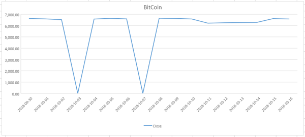
Display Blank As
In previous versions of SpreadJS, chart data that referenced empty or null cells would just automatically fill in the missing data. In the case of a line chart, the line would continue from the last point to the next. With this new enhancement, a developer will be able to specify if they want those empty data points to not show in the chart. Now, the options for displaying empty data with the displayBlanksAs function are gaps and zeros.
The following shows the default chart using the null values:
The following code shows you how to render a blank or null value in the chart as 0 using the DisplayBlanksAs property:
chart.displayBlanksAs(GC.Spread.Sheets.Charts.DisplayBlanksAs.zero);
The chart would now look like the following:
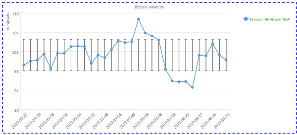
Display Unit for Axis
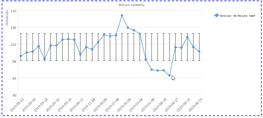
The Display Unit property allows you to display units like Million/Trillions as the value axis display instead of the actual large numbers. This feature is useful to conserve space and makes it easier to read.
For example, we have data using thousands (ie 10,000). We can use DisplayUnit to display these values as hundreds in left of the axis.
The following chart sets the displayUnit property to display hundreds using the following code:
// set display unit
function setDisplayUnit(chart) {
    let axis = chart.axes();
    if (!axis.primaryValue.displayUnit) {                        axis.primaryValue.displayUnit = {
             unit: chartNS["DisplayUnit"]["hundreds"], visible:true
        }
    }
    chart.axes(axis);
}

//add displayUnit
setDisplayUnit(chart)
Hover Styles and animation
Last but certainly not least, SpreadJS now supports hover animation and hover style to enhance the user experience while interacting with charts.
Hover animation allows users to interact with the data points in the chart. For example, apply hover animation effects to the data points to enlarge and provide additional details about the plotted data point.
Applying different hover styles allows users to highlight different data points in the chart. For example, modify the color, transparency, line width, line color, line transparency, line type, symbol color, symbol transparency, symbol line width, symbol line color, symbol line transparency, and symbol line type, while applying hover styles to the charts.
The following code shows how you can apply be styles and animations:
//set hover styles and animation
function setHoverStyleAnimation(chart) {
    //style series
    var hoverStyle = chart.hoverStyle();
    if (!hoverStyle) {
        hoverStyle = {
            color:'coral',
            transparency: 0.6,
            borderStyle: {
                transparency: 0.5,
                color: "red",
                width:3
            },
            symbolStyle: {
                transparency: 0.5,
                width: 55,
                color: "green"
            }
        };
        chart.hoverStyle(hoverStyle);
}
//allow animation for Chart
 series chart.useAnimation(true);
}

//chart hover animation and styles
setHoverStyleAnimation(chart);
The following GIF shows the HoverStyles with Animation.
Download the Sample

Manish Gupta