Top Validation Techniques for an ASP.NET Core Datagrid
FlexGrid is a feature-rich datagrid control that provides built-in filtering, grouping, sorting, editing, and an extensible API for implementing customizations–among other impressive capabilities. These features make it one of the best datagrid controls on the market.
FlexGrid’s rich features are available cross-platform, including WinForms, WPF, ASP.NET MVC, Javascript, Blazor, and Xamarin.
In this blog, we focus on the C1 ASP. Net Core FlexGrid, as well as other validation techniques applicable to both the client and server. Let's explore a use case for a Web-Based Online Inventory System using FlexGrid used by a home décor company to manage its inventory.
The company's Inventory Manager must update inventory records at the end of each week based on sales, returns, or any item price changes.
Field-level validations must be considered when updating each record, such as ensuring complete descriptions or noting a certain price range. Following these validations is not as simple and can take a considerable amount of time. Using FlexGrid provides an effortless way to adhere to these validations and displays helpful messages for the user to understand the reason for potential errors.
Here is an example of the validations that we will apply using FlexGrid:
|
Property
|
Validation Rule
|
Error Message
|
|---|---|---|
| StockID | Autogenerated field; Should not be null. | The field cannot be null. |
| LotNo | The total length should be 11 with “LOT-GCF-” as the prefix | The value should be the length of 11. It should have the prefix “LOT-GCF-” and the last character should be digits. |
| Description | It should not be null. | The description should not be empty. |
| Price | It should not be null. The value should be between 10 and 1000. | The Price should be between 10 and 1000. |
| Discount (Display as %) | It should not be null. The value should be between 0 and 0.20. | The discount should be between 0 and 20% |
| Quantity | The value should not be less than 0. | Enter a positive number. |
ComponentOne FlexGrid allows the following data validation techniques to validate the data:
- Unobtrusive Validation
- CollectionView’s getError method
- FlexGrid’s itemValidator method
- FlexGrid’s cellEditEnding event
ComponentOne Asp.Net Core MVC Documentation
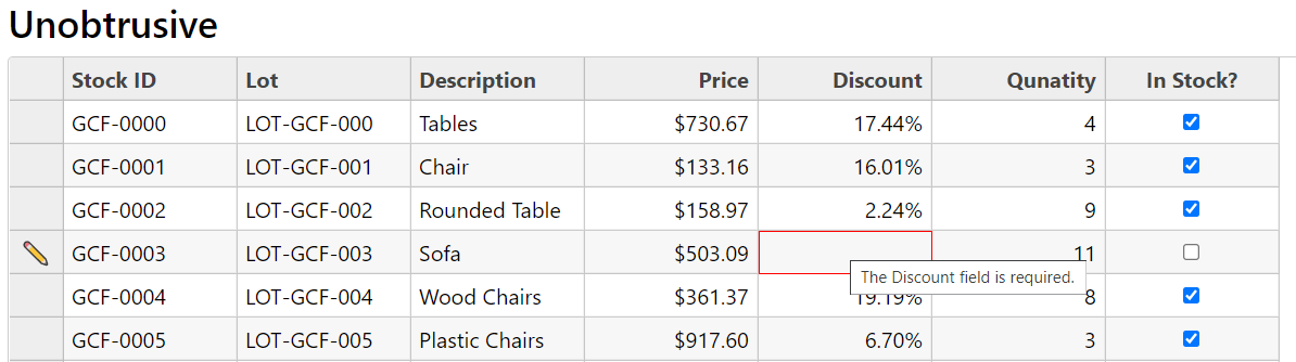
Unobtrusive Validation
Apply Unobtrusive Validation to pre-existing validation attributes from the Model class and reuse them on the client-side. Validate the data by defining the rules for the Model class without defining rules on the client-side.
Include the following files:
<script src="~/lib/jquery/dist/jquery.min.js"></script> @*If not already included in the project*@
<script src="~/lib/jquery-validation/dist/jquery.validate.min.js"></script>
<script src="~/lib/jquery-validation-unobtrusive/jquery.validate.unobtrusive.min.js"></script>
After adding the required files, add the validation rules with help of the Required and Range attributes. These attributes are mandatory to add rules for Unobtrusive Validation.
See the Model class with Validation Rules:
public class Stocks
    {
        [Required(AllowEmptyStrings =false,ErrorMessage ="{0} cannot be empty!")]
        public string StockID { get; set; }

        [Required(AllowEmptyStrings = false, ErrorMessage = "{0} cannot be empty!")]
        public string Description { get; set; }

        [Required(AllowEmptyStrings = false, ErrorMessage = "{0} cannot be empty!"),  StringLength(11, ErrorMessage = "The value should be length of 11!")]
        [RegularExpression("LOT-GCF-[0-9]{3}",ErrorMessage = "It should start with “LOT - GCF -” and last 3 character should be digits!")]
        public string LotNo { get; set; }

        [Required]
        [Range(10,1000,ErrorMessage = "The {0} should be between 10 and 1000!")]
        public double Price { get; set; }

        [Required]
        [Range(0, 0.20,ErrorMessage = "The {0} should be between 0 and 20%")]
        public double Discount { get; set; }

        [Required]
        [Range(0, int.MaxValue, ErrorMessage = "Please enter a positive number!")]
        public int Quantity { get; set; }

        public bool InStock { get; set; }

     }
The required files are included in the project and the rules are defined for the Model class. Now the Model class is ready for databinding with FlexGrid.
<script>
        // this script is to remove the % from the editing cell.
        function onBeginningEdit(s, e) {
            if (s.columns[e.col].binding == "Discount") {
                setTimeout(function () {
                    s.activeEditor.value = s.getCellData(e.row, e.col);
                })
            }
        }
   </script>
    <c1-flex-grid id="unobtrusiveGrid" style="max-height:500px;" auto-generate-columns="false" beginning-edit="onBeginningEdit">
        <c1-items-source source-collection="Model" disable-server-read="true"></c1-items-source>
        <c1-flex-grid-column binding="StockID" header="Stock ID" is-read-only="true"></c1-flex-grid-column>
        <c1-flex-grid-column binding="LotNo" header="Lot"></c1-flex-grid-column>
        <c1-flex-grid-column binding="Description" header="Description"></c1-flex-grid-column>
        <c1-flex-grid-column binding="Price" header="Price" format="c2"></c1-flex-grid-column>
        <c1-flex-grid-column binding="Discount" header="Discount" format="p2"></c1-flex-grid-column>
        <c1-flex-grid-column binding="Quantity" header="Qunatity"></c1-flex-grid-column>
        <c1-flex-grid-column binding="InStock" header="In Stock?"></c1-flex-grid-column>
    </c1-flex-grid>
Since this is a built-in validation, it adds the data-* attribute to the editing cell input. The error message is shown using the Title attribute. This message cannot be customized.
Note: While working with the Unobtrusive Validation, the cellEditEnding event’s cancel property is set to "true" if the input value is invalid. By checking if the cancel is "true", the cell can be preserved in edit mode by setting the stayInEditMode property to "true" for CellEditEndingEventArgs.
Check out the Unobtrusive Validation demo for more information.
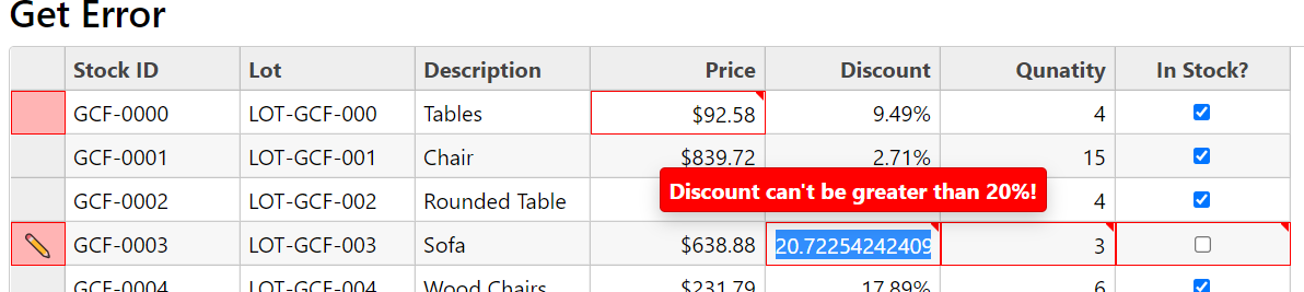
CollectionView’s getError Method
CollectionView’s getError method is used to validate the FlexGrid at the client-side using the CollectionView. It highlights the cells and RowHeaders if there is an error in the row’s data item. It accepts a callback function that accepts the three parameters, returns the error message based on the condition, and returns the null if there is no error. The getError method iterates for each data item and its properties and validates the value based on defined conditions.
<script>
    function getGridErrors(item, prop) {
        switch (prop) {
            case "Price":
                return (item[prop] < 100) ? "Price can't be less than 100!" : null;
                break;
            case "Discount":
                return (item[prop] > 0.20) ? "Discount can't be greater than 20%!" : null;
                break;
            case "InStock":
                if (item[prop] && item["Quantity"] <= 0) {
                    return "Quantity can't be 0 or lesser when InStock is true!";
                } else if (!item[prop] && item["Quantity"] > 0) {
                    return "Quantity can't be greater than 0 when InStock is false!";
                } else {
                    return null;
                }
                break;
            case "Quantity":
                if (item[prop] < 0) {
                    return "Quantity should not be less than 0!";
                } else if (!item["InStock"] && item[prop] > 0) {
                    return "Quantity can't be greater than 0 if InStock is false!";
                } else if (item["InStock"] && item[prop] == 0) {
                    return "Qunatity can't be 0 if the InStock is true!"
                } else {
                    return null;
                }
                break;
            default:
                return null;
        }
    }
</script>
By setting the FlexGrid’s showErrors to "true", you gain the ability to highlight erroneous cells with a red border. By setting the validateEdits to "true", you cannot exit the cell in edit mode until the value is incorrect.
Implement the FlexGrid with CollectionView validation using the following:
<c1-flex-grid id="getErrorGrid" style="max-height:500px;" auto-generate-columns="false" show-errors="true" validate-edits="true">
    <c1-items-source source-collection="Model" disable-server-read="true" get-error="getGridErrors"></c1-items-source>
    <c1-flex-grid-column binding="StockID" header="Stock ID"></c1-flex-grid-column>
    <c1-flex-grid-column binding="LotNo" header="Lot"></c1-flex-grid-column>
    <c1-flex-grid-column binding="Description" header="Description"></c1-flex-grid-column>
    <c1-flex-grid-column binding="Price" header="Price" format="c2"></c1-flex-grid-column>
    <c1-flex-grid-column binding="Discount" header="Discount" format="p2"></c1-flex-grid-column>
    <c1-flex-grid-column binding="Quantity" header="Qunatity"></c1-flex-grid-column>
    <c1-flex-grid-column binding="InStock" header="In Stock?"></c1-flex-grid-column>
</c1-flex-grid>
Note: This method can work only when the FlexGrid is in bound mode.
Check out the CollectionView's getError demo online.
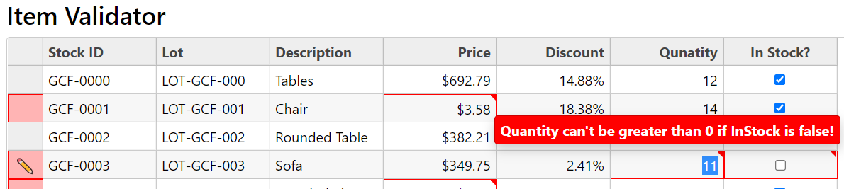
FlexGrid’s itemValidator Method
The ItemValidator method also accepts a callback, but it iterates through each cell and validates the cell value. It works for both a bound and unbound FlexGrid. It accepts a row and column index and can fetch data using the getCellData() method. Based on the column index, the column binding is based on the row index. Fetch the data item to apply validation on FlexGrid.
<script>
    function getGridItemErrors(row, col, parsing) {
        var grid = wijmo.Control.getControl("#itemValidatorGrid");
        var prop = grid.columns[col].binding;
        var item = grid.rows[row].dataItem;
        switch (prop) {
            case "Price":
                return (item[prop] < 100) ? "Price can't be less than 100!" : null;
                break;
            case "Discount":
                return (item[prop] > 0.20) ? "Discount can't be greater than 20%!" : null;
                break;
            case "InStock":
                if (item[prop] && item["Quantity"] <= 0) {
                    return "Quantity can't be 0 or lesser when InStock is true!";
                } else if (!item[prop] && item["Quantity"] > 0) {
                    return "Quantity can't be greater than 0 when InStock is false!";
                } else {
                    return null;
                }
                break;
            case "Quantity":
                if (item[prop] < 0) {
                    return "Quantity should not be less than 0!";
                } else if (!item["InStock"] && item[prop]>0) {
                    return "Quantity can't be greater than 0 if InStock is false!";
                } else if (item["InStock"] && item[prop] == 0) {
                    return "Qunatity can't be 0 if the InStock is true!"
                } else {
                    return null;
               }
                break;
            default:
                return null;
        }
    }
</script>

<c1-flex-grid id="itemValidatorGrid" style="max-height:500px;" auto-generate-columns="false" item-validator="getGridItemErrors" show-errors="true" validate-edits="true">
    <c1-items-source source-collection="Model" disable-server-read="true" ></c1-items-source>
    <c1-flex-grid-column binding="StockID" header="Stock ID"></c1-flex-grid-column>
    <c1-flex-grid-column binding="LotNo" header="Lot"></c1-flex-grid-column>
    <c1-flex-grid-column binding="Description" header="Description"></c1-flex-grid-column>
    <c1-flex-grid-column binding="Price" header="Price" format="c2"></c1-flex-grid-column>
    <c1-flex-grid-column binding="Discount" header="Discount" format="p2"></c1-flex-grid-column>
    <c1-flex-grid-column binding="Quantity" header="Qunatity"></c1-flex-grid-column>
    <c1-flex-grid-column binding="InStock" header="In Stock?"></c1-flex-grid-column>
</c1-flex-grid>
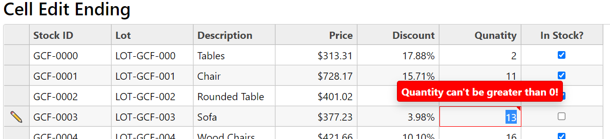
FlexGrid’s cellEditEnding Event
Validation can also depend on another field of the dataItem or FlexGrid cells. In this case, the cellEditEnding event is useful, as it provides both the new and old values. Fetch other values using the getCellData() method.
For example, Stocks have the InStock property, and it depends on the Quantity. If the quantity is 0, the InStock cannot be true (and vice versa. In this case, the cellEditEnding event would be handled to stay in edit mode, depending on if the input value is not valid. Add the error class and show the Tooltip.
<script>
    var tip;
    c1.documentReady(function () {
        tip = new wijmo.Tooltip();
        tip.cssClass = "wj-error-tip";
    })
    function gridCellEditEnding(s, e) {
        var prop = s.columns[e.col].binding;
        if (prop == "Quantity") {
            var value = parseFloat(s.activeEditor.value);
            if (s.getCellData(e.row, "InStock", false) && value <= 0) {
                var cellHost = s.cells.getCellElement(e.row, e.col);
                wijmo.addClass(cellHost, "wj-state-invalid");
                e.stayInEditMode = true;
                tip.setTooltip(cellHost, "Quantity can't be less than 0!");
            } else if (!s.getCellData(e.row, "InStock", false) && value > 0) {
                var cellHost = s.cells.getCellElement(e.row, e.col);
                wijmo.addClass(cellHost, "wj-state-invalid");
                e.stayInEditMode = true;
                tip.setTooltip(cellHost, "Quantity can't be greater than 0!");
            } else {
                var cellHost = s.cells.getCellElement(e.row, e.col);
                wijmo.removeClass(cellHost, "wj-state-invalid");
                tip.setTooltip(cellHost, null);
            }
        }
        if (prop == "InStock") {
            var value = s.activeEditor.checked;
            if (value && s.getCellData(e.row, "Quantity") <= 0) {
                var cellHost = s.cells.getCellElement(e.row, e.col);
                wijmo.addClass(cellHost, "wj-state-invalid");
                e.stayInEditMode = true;
                tip.setTooltip(cellHost, "InStock can't be true if Quantity less than or equal 0!");
            } else if (!value && s.getCellData(e.row,"Quantity")>0) {
                var cellHost = s.cells.getCellElement(e.row, e.col);
                wijmo.addClass(cellHost, "wj-state-invalid");
                e.stayInEditMode = true;
                tip.setTooltip(cellHost, "InStock can't be false if Quantity greater than 0!");
            } else {
                var cellHost = s.cells.getCellElement(e.row, e.col);
                wijmo.removeClass(cellHost, "wj-state-invalid");
                tip.setTooltip(cellHost, null);
            }
        }
    }
</script>

<c1-flex-grid id="cellEditGrid" style="max-height:500px;" auto-generate-columns="false" cell-edit-ending="gridCellEditEnding">
    ….
    <c1-flex-grid-column binding="Quantity" header="Qunatity"></c1-flex-grid-column>
    <c1-flex-grid-column binding="InStock" header="In Stock?"></c1-flex-grid-column>
</c1-flex-grid>
ComponentOne Asp.Net Core MVC Documentation | Download Demo Sample

Manish Gupta