Posted 18 September 2018, 12:15 am EST
Hi
Please send me code for Vb.net + AR 10 100 Percent Stacked Area Chart. I also want to change the colors of the different series.
Thank you.
Forums Home / ActiveReports / ActiveReports v7+
Posted by: douglass on 18 September 2018, 12:15 am EST

douglass
Posted 18 September 2018, 12:15 am EST
Hi
Please send me code for Vb.net + AR 10 100 Percent Stacked Area Chart. I also want to change the colors of the different series.
Thank you.

mohitg
![]()
Posted 18 September 2018, 8:39 pm EST
Hello,
Please refer to the “Charting” sample product sample. You can find the same at the following location:
C:\Users\mohitg\Documents\GrapeCity Samples\ActiveReports 10\Section Reports\Layout\Charting\VB.NET
Also, you can refer to the following documentation links:
http://help.grapecity.com/activereports/webhelp/AR10/webframe.html#arWLKChartWalkthroughs.html
http://help.grapecity.com/activereports/webhelp/AR10/webframe.html#arWLKChartWalkthroughs.html
If you are using Page/RDL report, Please let me know.
Hope it helps.
Thanks,
douglass
Posted 24 September 2018, 10:05 pm EST
Hi
Thank you, but this does not help me. I have a stack area percentage report. I have figured it out how to change the colors, but my chart goes to 200% and not 100%. I sort of got this right. I use vb.Net code in a section report. I also see that my first year duplicates and it omit my last year on the X- axis.
douglass
Posted 24 September 2018, 10:09 pm EST
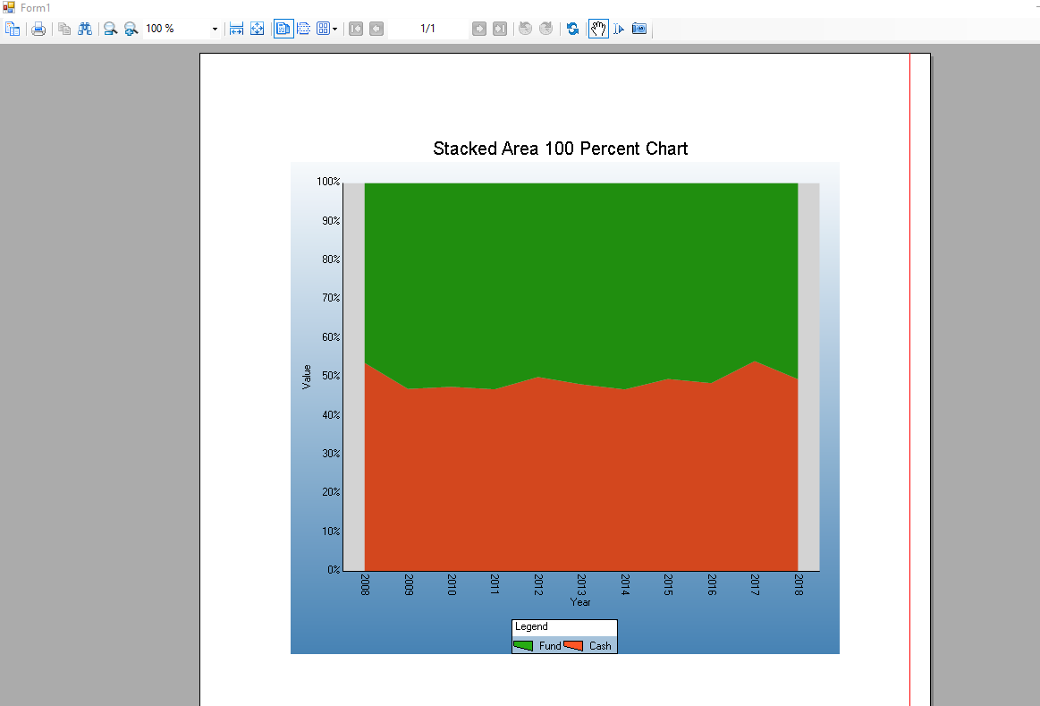
Here is the graph
mohitg
![]()
Posted 24 September 2018, 10:12 pm EST
Hello,
Could you please attached the file in “Zip” format. Because only “Zip” and “png” format is supported.
Thanks,
mohitg
![]()
Posted 25 September 2018, 8:33 pm EST - Updated 30 September 2022, 9:00 am EST
Hello,
I have created the application for you show how to implement the “Stacked100Percent” chart. Please refer to the attachment.
Hope it helps.
if the issue still is not resolved, please let me know.
Thanks,
Stacked_Bar_VB.NET.zip
mohitg
![]()
Posted 25 September 2018, 8:55 pm EST
douglass
Posted 25 September 2018, 10:11 pm EST
Hi
My code and your code is the same, but I still get the duplicate year thing on the x-axis.
mohitg
![]()
Posted 25 September 2018, 10:23 pm EST
Hello,
Have you grouped the data by “Year” in the SQL query?
Thanks,
douglass
Posted 25 September 2018, 11:08 pm EST
No, I have just Order by year. There is no aggregated functions and it is daily data.
mohitg
![]()
Posted 25 September 2018, 11:15 pm EST
Hello,
In my understanding, you need to group the data by “Year” to show the distinct value of “Year” in the chart. Also, If you grouped the data you need to aggregate the data by some function to show value in the chart as per year.
Am I missing anything?
Thanks,
douglass
Posted 25 September 2018, 11:15 pm EST - Updated 30 September 2022, 9:00 am EST
 Seems it has something to do with the spacing of the labels.
mohitg
![]()
Posted 25 September 2018, 11:21 pm EST
Yes, If you can’t group them then it shows the all the year value. If you extend the chart, you will see the more year label. So, I would suggest you to group them by year.
douglass
Posted 25 September 2018, 11:35 pm EST
Ok, maybe I miss something .
I need the daily Values to display. I build in the sum now and group by the Date
SELECT MyDescription = (Select Year(ValuationDate)),
		sum(F.PortfolioValue) as MyValue, sum(F.CashValue) as MyValue2
From PortfolioAssetAllocationFinal F
Where F.ReportingPortfolioID = @ReportingPortfolioId
And F.ValuationDate <= @ValuationDate
Group By  ValuationDate
Order By MyDescription
The data looks then like this (2761 rows), which is exactly the same as without the sums and group by., but the graph still looks the same. Is there no way to switch off duplicate labels?
2008 100 0
2008 100 0
2008 100 0
2008 100 0
2008 100 0
2008 60 40
2008 60 40
2008 60 40
2008 60 40
2008 60 40
2008 20 80
2008 20 80
2008 20 80
2008 20 80
2008 20 80
2008 10 90
2008 10 90
2008 10 90
2008 10 90
2008 10 90
2008 10 90
2008 10 90
2008 10 90
2008 10 90
mohitg
![]()
Posted 25 September 2018, 11:59 pm EST
Hello,
Please try the following SQL query
SELECT
MyDescription = (Select Year(ValuationDate)),
sum(F.PortfolioValue) as MyValue, sum(F.CashValue) as MyValue2
From
  PortfolioAssetAllocationFinal F
Where
  F.ReportingPortfolioID = @ReportingPortfolioId
  And F.ValuationDate <= @ValuationDate
Group By
  Year(ValuationDate)
Order By
  MyDescription
Hope it helps.
douglass
Posted 26 September 2018, 12:07 am EST
Try that, but then you do not get they daily or even monthly values.
It return, which is totally wrong.
2008 10490 15710
2009 11850 14250
2010 14590 11510
2011 19650 6350
2012 22920 3180
2013 25000 1100
2014 24250 1850
2015 23900 2200
2016 17630 8470
2017 22180 3820
2018 6030 9170
mohitg
![]()
Posted 26 September 2018, 12:11 am EST
Could you please explain the data you want to show in the chart. How the chart should appear? Which data do you want to show on X axis? Which data do you want to show on Y axis?
Thanks,
douglass
Posted 26 September 2018, 12:21 am EST
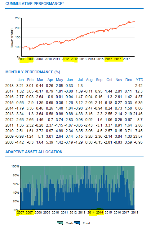
the chart as it is, is correct now, except for the x Axis repeating labels. the year show more than once and the last year is omitted.
thus
X- axis → the year
Y -axis → the percentage value
graph series 0 and 1 → the daily values as captured in the database.
series(0)
ValueMembersY -->PortfolioValue (MyValue1)
ValuemembersX–> Year (MyDescription)
Series(1)
ValuemembersX–> Year (MyDescription)
ValueMembersY -->CashValue (Myvalue2)
mohitg
![]()
Posted 26 September 2018, 1:23 am EST
Hello,
As a workaround I suggest you to loop through the points collection.
By looping through the points collection, you’d be able to set some sort of boolean for each month. If it’s the first time the year has been displayed(the xvalue of the points), add “2008” or “2009” etc to the axis x labels collection. Otherwise, add an empty string. Like below
 Dim CurrentYear = 0

        For i As Integer = 0 To chartControl1.Series(0).Points.Count - 1

            If chartControl1.Series(0).Points(i).XValue <> CurrentYear Then
                chartControl1.Series(0).AxisX.Labels.Add(chartControl1.Series(0).Points(i).XValue)
                CurrentYear = chartControl1.Series(0).Points(i).XValue.ToString
            Else
                chartControl1.Series(0).AxisX.Labels.Add(" ")
            End If
        Next
Also, Please adjust the “LabelsGap” property to adjust the “Labels” on X Axis.
Hope it solves your problems.
Thanks,
mohitg
![]()
Posted 26 September 2018, 7:20 pm EST
Hello,
As per your requirement, you need to show data according to daily/monthly basis on the chart. If you bind the X-axis with year column(extracting from the date column) then, its by-design behavior to show the duplicate value of “Year” on X-axis. Because the “Year” column contains the duplicates value. Hence, this is the design and correct behavior of the control.
Also, you do not want to group them as per year because you need to show the data as per daily/monthly basis. So, the only way to achieve this to follow the suggestion given in my previous reply.
If there is anything else that you want to confirm, please let me know.
Thanks,
douglass
Posted 26 September 2018, 9:18 pm EST
Hi Mohitg
Thank you. I have tried your suggestion, but it have no effect. Where must I place the code? I have placed it on different places, but no effect. I place it just after binding the series(0).ValueMemberX and y. Then just after adding the series and then then I also tried to put it in the Detail_BeforePrint sub. still no effect. I then did it in SQL, but then I get weird numbers on the graph.
mohitg
![]()
Posted 26 September 2018, 9:49 pm EST
Hello,
You can add the code in “DetailFormat” event after assigning the value to series. Please refer to the attached sample.
Thanks
douglass
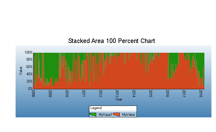
Posted 26 September 2018, 10:55 pm EST - Updated 30 September 2022, 9:00 am EST
Hi
Tried that, not working. Then I removed your code and just set the label gap to 60. I then get the following graph. Now only the first year is duplicated. Tried to remove the first axis label, but this is also not working. 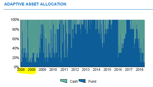
mohitg
![]()
Posted 27 September 2018, 6:56 pm EST
Hello,
Could you please share the application of your chart along with DB so that I can find the workaround if exits.
Thanks,
douglass
Posted 27 September 2018, 7:33 pm EST
Good Morning
I have put my code and data in text files for you in the zip folder. Thank you for your help.