C1AutoComplete and C1EntityFrameworkCore VirtualDataCollection

Posted by: james on 26 February 2024, 5:57 pm EST

  • Posted 26 February 2024, 5:57 pm EST

    • We are building a Blazor Page where we want the user to enter an “item number”.
    • The items datasource is an sql table with thousands of entries.
    • The items are available as a model through an Entity Framework DB context.

    My thoughts were that the best way to do this is

    • C1AutoComplete for the entry box, and
    • C1EntityFrameworkCoreVirtualDataCollection as a datacollection to bind to the auto complete box.

    Having a VirtualDataCollection means that the thousands of entries do not have to be all loaded.

    Function

    User types the first couple of letters, and the collection is searched and displays matching records in the autocomplete drowndown that the user can choose…

    Issues

    1. The autocomplete list’s scrollbar resets to the top after dynamically loading more entries, disrupting the user’s scrolling. When the user scrolls the autocomplete list to rows that have not loaded yet: The entries dynamically load, but the list auto scrolls back to the first entry after loading. In other words, the scroll bar jumps on the user, and goes back to the home position (first entry in list) while the user is scrolling. This happens both for when the user clicks the dropdown with no text in the box (so for all records), and also if the user has filtered for say “AAA” and there are 50 records, it also happens when they start scrolling in that scenario.

    2. After an item has been selected, if the user presses the dropdown again it shows all items - is there a way to get it to only show the item the user has selected/is currently filtered for? Instead of the full list.

    Additional Concerns

    • I’m not sure if this is the best way to tackle the requirements.
    • I’m reevaluating if C1AutoComplete and C1EntityFrameworkCoreVirtualDataCollection are optimal for our needs. I choose them after browsing through the different controls and collections I could find.
    • I’m open to suggestions for alternative approaches or components.

    I’ve gone ahead and attached my .Razor file to this post, but let me know if you require a full sample. The solution is hooked up to our database server, and also has a bunch of other stuff, so I would need to make a separate app and simulate the data.

    Your answer to my questions and any other advice and samples you can provide would be most helpful. I’ve found it hard to find detailed docs and samples for the Blazor Control and Data stuff. I’ve mainly used Mescius WinForms stuff over the years, and have only just started with Blazor.

    ItemRegister.zip

  • Posted 27 February 2024, 9:07 pm EST

    Hello,

    Thank you for sharing the sample. We are able to replicate the issue at our end.

    1. Resetting scroll position

      For this, we should use the C1CursorCollectionView instead of the VirtualCollection.

    2. After an item has been selected, if the user presses the dropdown again it shows all item

      For this, by default the FilterString would be the last search string, to make it to selected item, we need to call the search api with the selected item

    Please refer to the attached sample for reference.

    Regards,

    Manish Gupta

    AutoComplete_loadAsyncItems.zip

  • Posted 28 February 2024, 2:40 pm EST - Updated 28 February 2024, 2:45 pm EST

    Hi Manish

    Thank you. After I made the post I did go ahead use C1EntityFrameworkCoreCursorDataCollection as I wondered what that one was, and it worked well - it kept the position, and appears to be virtual.

    1. I didn’t extend the class like you do in your sample, is that necessary, or only if we are using an API instead of an Entity Framework Context? But I do think it is a nice way to include your own filter function that does the heavy lifting instead of hardcoding it as part of the page.

    2. I managed to solve the problem of showing what was previously filtered by storing the last used filter expression when a filter gets applied, and then I re-apply this filter when the dropdownopenchanged is fired, but I guess I could re-apply the filter when OnItemSelection is triggered instead. My solution of re-applying the previous filter has the benefit of having the same “position” on open in the list, so that when you re-open it, the item that was selected is still the item highlighted in the list… because if the items displayed on open are different when it opens the second time, then the selected position is off, and a different entry is highlighted. your solution has this problem, but I guess there is another way to re-highlight the correct entry.

      I’m happy with the way I have solved it, but I am open to any advice you may have.

    3. On a completely separate topic, but specifically about the AutoComplete box I have a question regarding styling hopefully you can help me with. I am trying to apply styles and I am coming across problems where certain style elements appear to be hardcoded within the control… I am probably making some sort of fundamental error, but if you could help me out or point me to some samples or something that would be most appreciated.

    After a lot of tweaking I was able to get it looking pretty good, except for one thing.

    The best way I could get it to work, was to make my own css class and apply it along with the c1 style. For example, Class=“c1-drop-down form-control-mycustom” for the autcomplete, and Class=“c1-text-box form-control-mycustom” for a textbox…

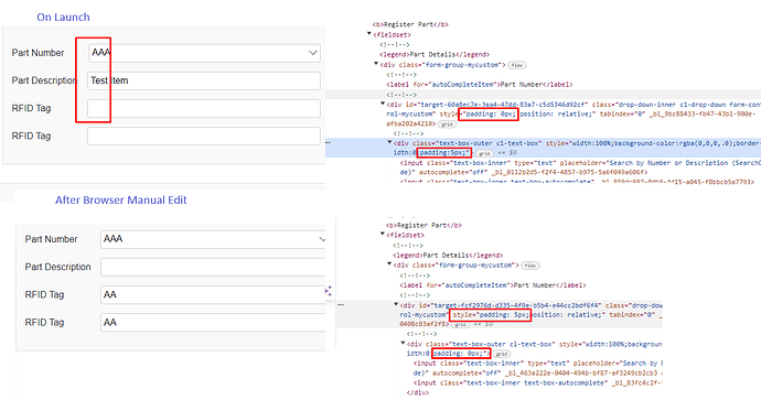
    But I still have an issue regarding padding and alignment. It appears the generated HTML for the autocomplete control hardcodes a padding of 0px into the outer div, and hardcodes a padding of 5px into the 2nd div.

    Whereas with a c1textbox control, the generated HTML hardcodes a padding of 5px into the outer div.

    This has the effect of the elements not aligning as I’ve shown in my attached screenshot below.

    I’ve also shown that I was able to make it look correct by manually modifying the padding in the browser debugger.

    There are other oddities I haven’t quite worked out regarding stuff like the highlighting of input elements when they are in focus, which works for non c1 controls, but I’m still getting familiar with everything.

    I did try a bunch of other methods, such as modifying the existing style classes, or using purely my style classes instead of c1, but I could not get around what appears to be certain hardcoded values in the controls. Hopefully I’m doing something wrong that is easily fixed.

    Thanks again.

  • Posted 28 February 2024, 3:46 pm EST - Updated 28 February 2024, 3:51 pm EST

    Hello,

    Thank you for let us know that your issue has been resolved by C1EntityFrameworkCoreCursorDataCollection and sharing the class here for further reference.

    1. Please note that if the default class is not working correctly or you need some custom logic, you may write the custom class inherited from base class. But in your case, it works fine, you need not to write the custom class.
    2. If it works for you as the way you would like to work, it’s great and you may continue with that. In the previous reply, it seems I got confused that you would like to filter the items for text with the selected item, so I suggested that approach.
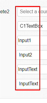
    3. By default, the C1TextBox and C1AutoComplete align correctly. Please refer to the following screenshot:

    Further for your information, the C1AutoComplete uses the C1TextBox to enter the text and hence the parent/outer div sets the padding 0 for C1AutoComplete.

    Please refer to the screenshot:

    Hope it clears!

    Regarding your styling, we need a separate small demo sample for replicating the issue for further investigation.

    Regards,

    Manish Gupta

  • Posted 29 February 2024, 3:08 pm EST

    Hi Manish

    Thanks again for your response.

    In regards to #2 I wanted when a user presses the dropdown for it to appear the same as when the dropdown was displayed when they made their selection from the dropdown, and to have the same item highlighted that they selected. As you mentioned, the way I am tackling it works, so I am happy.

    My issue originally was that after an item is selected, the filter is automatically cleared. Which in my opinion had two negative consequences, - the main one is that the “position” of the list incorrectly shows the wrong highlighted item when the dropdown is displayed again

    (for example, if item 3 was selected on the filtered dropdown, when you re-open it shows all items (unfiltered), and the list automatically highlights item 3 - the issue is item 3 is no longer the correct item that the user selected, because item 3 on the unfiltered list is different to item 3 on the previously filtered list…

    I like my solution, because the filter does not disappear, and on re-open it looks the same as it did before it closed. It also has the benefit that the selected (highlighted) item in the drop down stays the same

    Thanks with your comments regarding the styling, I will need to spend some more time on it and get together a sample for you.

  • Posted 3 March 2024, 7:09 pm EST

    Hi,

    Thank you for your confirmation. We will wait for your sample regarding styling in case you have any questions.

    Regards,

    Manish Gupta

  • Posted 27 March 2024, 1:41 pm EST - Updated 27 March 2024, 1:46 pm EST

    I have three problems.

    Apologies for the length and complexity, but it was hard to simplify the issue.

    I spent a good couple of hours putting this sample together, so I hope I was able to explain the problems sufficiently and succinctly enough.

    When running the solution, please be sure to clear browser cache (ctrl-f5) when following the style switching instructions.

    Please make sure to maximize the browser window, or have the width at least 800 pixels due to the media style, as the layout is different when browser is very small.

    The first is very easy to explain, so I will start with that:

    Issue 1 – Magic Text

    There is an issue with the C1 AutoComplete, reproducible by:

    • Click the AutoComplete
    • Type some text “A”
    • Press tab once
    • Type some more text “AAAAAAAAAA”

    You will see that when you press tab, it changes to a nested element that allows you to type and text is displayed, in a different font.

    In addition, it takes 3 tab presses from the user to get to the next control in the form – so not intuitive from the user standpoint.

    Issue 2 – Alignment, Sizing, and Padding Issue

    As far as I can tell, the issue stems from the C1 controls being nested elements, and not being able to apply certain styles to the outermost element. It is very difficult to solve completely because styles are shared between the c1textbox and c1autocomplete but in different parts of the nesting.

    This occurs when using a flex layout with dynamic width, but it appears it would happen in other scenarios too.

    You will notice a lot of mess in my CSS etc… but this was the way I managed to partially resolve the issue.

    I have managed to come up with 2 partial solutions:

    1. Allows the lining up of all C1 controls, but when trying to get padding to work for the non-C1 elements messes up the alignment. I can use this solution, as long as I don’t use any non C1 controls.

    2. Lines up C1 controls and non-C1 elements, but the AutoComplete does not line up. As far as I can tell this is due to the position of element nesting that the AutoComplete applies its padding on which differs from the other C1 controls.

    Run Instructions for Solution 1

    • Copy the contents of app-1.css into app.css
    • This will show you solution 1.
    • When running, refer to the display in “Solution 1 Section”.
    • You will notice the autocomplete, and the c1textbox line up, and work as expected.
    • But the Input1 (with no padding), and the Input2 with padding:

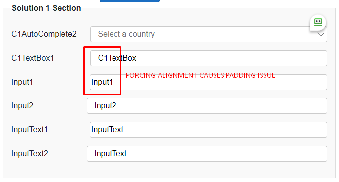
      o No padding makes the alignment of the boxes look correct, but the inside text not.

      o With padding, the alignment of the boxes is wrong, but the inside text is correct.

    Run Instructions for Solution 2

    • Copy the contents of app-2.css into app.css
    • When running, refer to the display in “Solution 2 Section”.
    • You will notice everything lines up, except for the AutoComplete

    Issue 3 – ReadOnly styles

    If you have a look at the button “Flick ReadOnly” you will see that it changes the Read Only state of the C1TextBoxes and the html input and blazor inputtext controls.

    The issue is that I can’t use styles to change the background colour of the C1TextBox dependent on the ReadOnly value, because the ReadOnly is only applied to 1 of the elements of the nested controls generated by a C1TextBox.

    You will see that the C1TextBox doesn’t turn grey when using the button.

    I can set a static style to make the C1TextBox grey, but it does not behave the way it should when changing the state of the textbox via the button.

    The .form-control-mycustom[readonly] style is the one which applies the grey colour depending on the state of readonly. I have tried using text-box-inner, c1-text-box, with [readonly] but it doesn’t work because the part of the control that needs the shading does not get its state changed to readonly when the control is set to readonly.

    Summary

    I’d like a solution to all my problems above if possible, please.

    In general, I am curious the way these sort of issues are solved, because it appears to me that it would be a common issue, especially the TAB button issue I would have thought someone else would have come across.

    Are the C1 Blazor controls popular – they just seem to be a bit clunky – but that could just be me not being advanced enough. It appears that any solution I can employ will not be elegant.

    I’ve noticed a bunch of 5px hard coded in certain areas of the generated controls, which I believe was to get around the shared style implications between the different controls and their nesting level - which I think stems from the nested elements generated for a single control. I could be wrong about this.

    C1BlazorIssues.zip

  • Posted 31 March 2024, 8:49 pm EST

    Hello James,

    Thank you for your detailed explanation and the sample.

    1. We are able to replicate the issue at our end and this issue has been forwarded to the concerned team with the internal tracking id: C1XAML-32133

    2. We would like to get some confirmation from you for further investigation.

      Please let us know if you are concerned about only with the padding of the controls using your custom CSS class. Or it is also related to the alignment in the same line.

      Please confirm.

    3. We are able to replicate the issue and it has been forwarded to the concerned team with the internal tracking id: C1XAML-35878

      In the meantime, you may use the following workaround by adding the following CSS:

    .form-control-mycustom input[readonly="true"] {
        background-color: #e9ecef !important;
        opacity: 1 !important;
        border-top: inherit;
        border-radius: inherit;
        border-bottom: inherit;
        border-left: none;
        border-right: none;
    }

    Thank you for your patience.

    Regards,

    Manish Gupta

  • Posted 1 April 2024, 4:36 pm EST - Updated 1 April 2024, 4:41 pm EST

    Hi Manish

    Thank you for your response.

    1. Thanks.

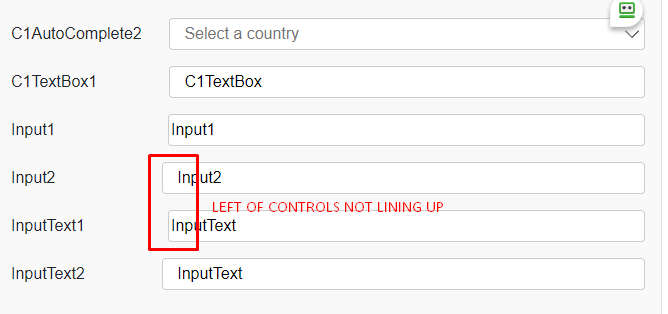
    2. The issue is getting the controls lining up across multiple lines, when using something like a “Width %” with padding. Ours is using a flex layout, but I’d say the issue would happen in other scenarios too. Any attempt to resolve the issue with a workaround, ends up in one of the two scenarios I described above.

    To try and make it clearer, I’ve attached screenshots below highlighting the problems. It not only happens between C1 controls and non-C1 controls, but also between the C1TextBox and C1AutoComplete unless you manually override some settings as I tried to highlight in Solution 2.

    1. This works, but I’m also trying to get the C1AutoComplete to be readonly. The only available property that looks like it would what to use is “IsEditable”, but this causes a runtime exception of InvalidOperationException: Unable to set property ‘IsEditable’ on object of type ‘C1.Blazor.Input.C1AutoComplete`1[[C1BlazorIssues.Country, C1BlazorIssues, Version=1.0.0.0, Culture=neutral, PublicKeyToken=null]]’. The error was: IsEditable property is not settable in C1AutoComplete.

    Thanks

    Kind Regards

    James

  • Posted 1 April 2024, 5:16 pm EST - Updated 1 April 2024, 5:21 pm EST

    Apologies for the 2nd post here, but I thought I’d add a couple of things to my post a moment ago:

    • I believe the reason why I can’t hack my way around the alignment issues is because the outermost div on the AutoComplete hardcodes a padding of 0px. I’ve attached a screenshot of the inspector.

    • Getting the C1AutoComplete and the C1TextBox to align properly with width and padding requires a few hacks which you can see in my code for the EditorStyle and CSS etc… but in doing so, makes the other controls not line up.

      By default, the C1TextBox will align nicely with the non-C1 controls when using Width and Padding settings.

      But not with the C1AutoComplete control (because of the hardcoded 0px IMO). It is possible to hack around it to get it to line up, but it throws off the other controls.

    Please also note that my screenshots above are just highlighting the 2 different issues - not necessarily the controls with the issue when you run your sample.

    All I am after is having everything align nicely in a flex layout using % for width, and padding to put a bit of a gap in the layout.

  • Posted 2 April 2024, 7:54 pm EST

    Hello,

    Please refer to the attached updated sample that shows the correct alignment and padding using the CSS. Regarding changing the color of the C1 Control, this is currently with the concerned team for further investigation.

    In the meantime, we may wrap the controls with a div and set the CSS for wrapper on property change.

    Please refer to the attached sample for reference.

    Regards,

    Manish Gupta

    Updated_Css_alignment.zip

  • Posted 4 April 2024, 10:11 am EST

    Hi Manish

    Thanks. I am away from the office for a couple of days. I’ll try out the sample ASAP.

    Kind Regards

    James

  • Posted 4 April 2024, 2:18 pm EST

    Hello James,

    Please take your time to investigate the sample. Let us know if you have any further questions.

    Regards,

    Manish Gupta

  • Posted 22 April 2024, 5:40 pm EST - Updated 23 April 2024, 10:34 am EST

    Please review your provided sample.

    It breaks the autocomplete dropdown.

    This is why I had to leave “c1-drop-down” as part of the css class definition.

    If you run the sample you gave me, and press the dropdown on the auto-complete, you will see it is all wonky and not usable. that’s because it is missing the styles it relies on. Hence why I had to use c1-drop-down style first, before my custom style.

    Edit: In addition to this, readonly does not work for the AutoComplete, you can still type and click the arrow - only the color appears to change.

    Please advise/fix.

    Thanks

  • Posted 23 April 2024, 11:15 pm EST

    Hi,

    As per my understanding, you are facing issue with the dropdown height of the C1AutoComplete is stretched. You could use the following css to fix that:

        .form-control-mycustom {
            flex: 3;
            .popup-content-container
    
                {
                    max-height: 50vh;
                }
    
    }

    Let me know if you still have the same issue.

    Regards,

  • Posted 28 April 2024, 2:39 pm EST - Updated 28 April 2024, 2:44 pm EST

    Doesn’t work - I tried it the way you have the CSS, and also as separate CSS entries, as I think you may have pasted it nested accidently? Either way, it didn’t work. In addition, it is not just the size of the box that has an issue, it’s also the fact the scroll bar is missing along with the location of the box. I don’t think it’s a good idea to remove the styles it needs.

    I’ve attached images of both a working one, and a not-working one to highlight the differences.

    Separately, the readonly fix does not work for the AutoComplete, you can still type and click the arrow - only the colour appears to change.

  • Posted 30 April 2024, 8:14 pm EST - Updated 30 April 2024, 8:19 pm EST

    Hi,

    I have tested with the provided css and it seems to be working fine at my end. The height is adjusted and also the scrollbar is visible. You could refer to the below gif that shows the steps in opening the C1AutoComplete.

    The Css is applied to the “app.css” file (refer to line no. 80). I am also sharing the screenshot below and the sample. Also, kindly hard reload the browser as sometimes the css changes are not reflected and comes from the cache.

    C1AutoComplete ReadOnly Property:

    You could add the “pointer-events” css property to “none” to prevent the pointer:

    .read-only-ctrl {
        background-color: #e9ecef !important;
        opacity: 1;
        pointer-events: none;
    }

    Further, the user can press the tab, to get the input control beneath the C1AutoComplete and then paste the content/type to the input element. To handle such situations, create a “script.js” file and add the following code:

    window.onload = function () {
        // Function to check if an element has the read-only class
        function hasReadOnlyClass(element) {
            // Check if the element itself has the class
            if (element.classList.contains('read-only-ctrl')) {
                return true;
            }
    
            // Check if any parent of the element has the class
            var parent = element.parentElement;
            while (parent) {
                if (parent.classList.contains('read-only-ctrl')) {
                    return true;
                }
                parent = parent.parentElement;
            }
    
            return false;
        }
    
        // Function to handle keyboard events
        function handleKeyDown(event) {
            if (hasReadOnlyClass(event.target)) {
                event.preventDefault();
            }
        }
    
        // Function to handle context menu
        function handleContextMenu(event) {
            if (hasReadOnlyClass(event.target)) {
                event.preventDefault();
            }
        }
    
        // Function to handle paste event
        function handlePaste(event) {
            if (hasReadOnlyClass(event.target)) {
                event.preventDefault();
            }
        }
    
        // Attach event listeners to the container element
        document.body.addEventListener('keydown', handleKeyDown);
        document.body.addEventListener('contextmenu', handleContextMenu);
        document.body.addEventListener('paste', handlePaste);
    }

    It handles all such situations. Let me know if you face any issues.

    Regards,

    Ankit

    Sample:

    Updated_Css_alignment.zip

Need extra support?

Upgrade your support plan and get personal unlimited phone support with our customer engagement team

Learn More

Forum Channels