Consolidated grouped rows and details rows on wijmo grid

Posted by: muddam.kranthi on 23 September 2020, 10:42 pm EST

    • Post Options:
    • Link

    Posted 23 September 2020, 10:42 pm EST - Updated 3 October 2022, 6:20 am EST

    Hi Team,

    I have hierarchy grid and I want to achieve the following. On load of grid the consolidated grouped values should display and on click of + symbol the details should be displayed as per the screenshots.

    Could you please help me achieve this.

    Thanks,

    Kranthi

  • Posted 26 September 2020, 3:52 pm EST

    Hi Team,

    Any update on this?

    Thanks,

    Kranthi

  • Posted 27 September 2020, 5:47 pm EST

    Hi,

    We are working on this and will provide you an update soon.

    Regards

  • Posted 27 September 2020, 11:36 pm EST

    Hi Kranthi,

    To achieve the required functionality you need to handle the click/mousedown event on the expand/collapse icon and hide/show the required rows to give the expand/collapse effect.

    Regards

  • Posted 28 September 2020, 5:58 pm EST - Updated 3 October 2022, 6:22 am EST

    Hello Team,

    I have a requirement like as below,

    I have to add two rows to the bottom of the FlexGrid, in which I have to merge first three columns and set a value and remaining columns need add Aggregate values.

    Please help me to add and merge the bottom rows in Angular8 Flex Grid

  • Posted 28 September 2020, 6:21 pm EST

  • Posted 29 September 2020, 1:06 am EST

    Hi Sharad,

    I have understood the hiding/show on expand event.

    Do we something like columnFooters for grouped rows.

    As shown in the first screenshot I want to group the data by Notice type(Projected, Initial, Final) column, and for each group of data I need to add consolidated row showing the sum of the grouped data.

    It would be helpful if any sample provided.

    Thanks,

    Kranthi

  • Posted 30 September 2020, 3:00 am EST

    Hi Team,

    Any update on the above query?

    Thanks,

    Kranthi

  • Posted 30 September 2020, 4:48 pm EST

    Hi Kranthi,

    Sorry for the late response. Please refer to the sample link below that demonstrates how you can add footer rows for each group:

    https://stackblitz.com/edit/angular-njlohk

    Let us know whether this works for you.

    Regards,

    Ashwin

  • Posted 4 October 2020, 8:11 pm EST

    Hi Ashwin,

    Thank you for the response. The sample provided worked.

    I want aggregation SUM values for the footer rows grouped

    for ex: In sample provided I want aggregation SUM to be displayed for footer rows for the columns Downloads, Sales and Expenses for the Active Sub group.

    Thanks,

    Kranthi

  • Posted 5 October 2020, 5:43 pm EST

    Hello Kranthi.

    You will need to handle the formatItem event of the grid and add the aggregates manually to the footer rows. Please refer to the sample link below for reference:

    https://stackblitz.com/edit/angular-rpw5du

    In this sample, I have also updated the addGroupfooter method to create a footer row using the parent row’s dataItem.

    ~regards

  • Posted 11 October 2020, 7:08 pm EST

    Hi Ashwin,

    Thank you for the response. The footer aggregates worked.

    I need one more help, I want a on click event on expand and collapse button of country in sample provided. So that I can handle what rows of the group to be displayed on load or ( hide or show the required rows of group) .

    I just need a on click event of expand/collapse in the sample provided.

    And also in group header text I want only the binding value.

    for ex: for group name: Country: US 2 (Items), I want only US to display.

    Also, I want all the columns data sorted in descending order on load of grid in the sample given.

    Could you please help achieve these.

    Thanks,

    Kranthi

  • Posted 11 October 2020, 7:45 pm EST

    Hello Kranthi,

    Please refer to the updated sample below:

    https://stackblitz.com/edit/angular-kpty2n

    I just need a on click event of expand/collapse in the sample provided.

    You can use the groupCollapsedChanged event of the FlexGrid. This event is fired when a group row is expanded/collapsed. In the event, you can use the isCollapsed property of the GroupRow to check whether the row is collapsed or expanded.

    I want only US to display.

    For this, you can use the groupHeaderFormat property of the FlexGrid. This property is used to format the group headers of each of the group row.

    https://www.grapecity.com/wijmo/api/classes/wijmo_grid.flexgrid.html#groupheaderformat

    I want all the columns data sorted in descending order on load of grid in the sample given.

    You will need to iterate over each column of FlexGrid and push a new SortDescription object to the CollectionView instance of the FlexGrid.

    ~regards

  • Posted 11 October 2020, 9:39 pm EST

    Hi Ashwin,

    Thank you for the response.

    I am getting below error on groupCollapsedChanged.

    e.getrow is not a function at eval

    Any suggestions?

    Thanks,

    Kranthi

  • Posted 11 October 2020, 9:53 pm EST

    Then, you can use the following code:

    var row = s.rows[e.row]
    

    The getRow method was added in the 20v1 version. So, for the versions before these need to use the rows array to fetch the row.

    ~regards

  • Posted 12 October 2020, 2:13 am EST

    Thank you Ashwin. This works.

  • Posted 15 October 2020, 7:20 pm EST - Updated 3 October 2022, 6:21 am EST

    Hi Ashwin,

    I need one more help.

    I have my grouped data grid as shown below. This is the default on load view as shown below:

    I have grouped the data on year and then by notice type.

    AS per my business req I need to show the grouped footer rows(grouped on notice type) only on load of grid as shown in above screenshot which I was able to achieve by using the collapseGroupsToLevel() method.

    As I have hidden my 2nd level of grouped header(Notice type) as per business rule, the hierarchy icon is getting shown as (-) on default load as shown in screenshot.

    But I need a (+) icon for the root level header row (year) and on click of the (+) icon I need the grid to be look as below:

    Could you please help handle this. Thank you in advance!

    Thanks,

    Kranthi

  • Posted 18 October 2020, 5:53 pm EST

    Hi Kranthi,

    The FlexGrid does not add a plus/minus icon by itself unless you are using row details (which I think you are not). It seems that you have manually added a minus icon on the grid. Can you let me know your implementation of how have you added the minus icons?

    The sample below shows how you can update the group collapse icons to plus/minus icons by using formatItem event. This is based on the default implementation of the FlexGrid:

    https://stackblitz.com/edit/angular-jtzfgm

    ~regards

  • Posted 18 October 2020, 8:53 pm EST

    Hi Ashwin,

    yes , I am not using details grid, but I have not manually added the -/+ icon.

    Please find the below grid code for reference.

    <wj-flex-grid #flexGrid class=“bento-flex-grid has-row-hover my-4”

    [(itemsSource)]=“data1” [stickyHeaders]=“true”

    [showMarquee]=“true” [headersVisibility]=“‘Column’”

    [selectionMode]=“‘MultiRange’”

    (initialized)=“gridInitialized(flexGrid)”>

        <wj-flex-grid-filter #filter [filterColumns]="filterColumns" 
          (initialized)="filterInit(filter)">
        </wj-flex-grid-filter>
    
        <wj-flex-grid-column [header]="'Type'" [binding]="'types'" [width]="150" 
             [allowSorting]="false"
            [align]="'right'">
    
            <ng-template wjFlexGridCellTemplate [cellType]="'ColumnHeader'" let- 
                   col="col" let-cell="cell">
                <div class="col-header-group-level d-flex">
                    <div *ngFor="let levelBtnID of [1, 2]; index as i" class="group-level-btn- 
                   cust"
                        [ngClass]="{ active: collapseLevel === i+1 }" 				 
                         (click)="collapseGroupsToLevel(i)">
                        {{ levelBtnID }}
                    </div>
                    <div class="group-level-title ml-1 pr-2">
                        {{ col.header }}
                    </div>
                </div>
            </ng-template>
        </wj-flex-grid-column>
    

    After this first column I have all other normal columns which do not have template.

    But my requirement is not just changing the +/- css style.

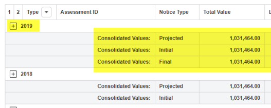
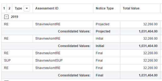
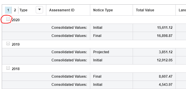
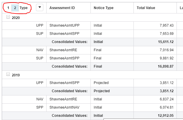
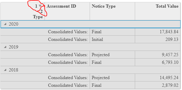
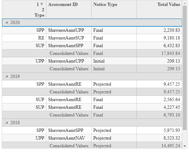
    I need the grid to have the default load with only grouped footer rows for child level group(notice type) visible on load of the grid and click of + button of group header parent group(year) all the detail rows and footer rows of child level data to be displayed as shown in the previous queries screenshots.

    Is there any event to expand/collapse to a level for only the current group. Similar to what we have for total grids groups with collapseGroupsToLevel().

    Thanks,

    Kranthi

  • Posted 19 October 2020, 11:47 pm EST

    Hi Kranthi,

    The group headers will always be displayed on the FlexGrid. We cannot hide the headers because otherwise, we will have no way to expand collapse the child rows for a default grid.

    Regarding the +/- minus icons, as I said, the grid does not add these icons automatically. There must be some formatting being applied on the grid. Can you please check whether an itemFormatter, formatItem, or a custom CellFactory is not being added to the grid?

    ~regards

  • Posted 21 October 2020, 10:55 pm EST - Updated 3 October 2022, 6:22 am EST

    Hi Ashwin,

    Please find the sample link below:

    https://stackblitz.com/edit/angular-vx9x46?file=src%2Fapp%2Fapp.component.html

    I have grouped the grid data on year and then by Noticetype

    (ntype).

    On load of grid I have hidden the group header of Notice type and group footer of year as per my business requirement. And the grid looks as below on load:

    When on click on number 2 on the grid header column Type the grid looks as below:

    And my requirement as below:

    1. On load of grid I need the same grid as shown in first screenshot with expand Icon which is currently a collapse icon.

    2. And on click of that expand icon I need the grid to be displayed as shown in second screenshot.(All the detail rows along with footer rows).

    Can we achieve the above kind of grouping or functionality in wijmo grid in any way.

    Thank you!

    Kranthi

  • Posted 23 October 2020, 12:51 am EST

    Hi Kranthi,

    I haven’t properly investigated your sample but it seems that you have updated the addGroupFooter method to add the footers on row level 1. That is why, when you collapse to level 1, the main header still shows as expanded because it is expanded.

    I will investigate a little more and update you as soon as possible.

    ~regards

  • Posted 26 October 2020, 12:09 am EST

    Hi Kranthi,

    I have updated the sample:

    https://stackblitz.com/edit/angular-dteedo

    I have added a formatItem event to add plus/minus icons on the top-level rows. I have also added a getRowCollapseLevel and collapseRowToLevel which checks the collapse level of particular rows and collapse a particular row according to a level.

    Let me know if this fulfills your requirements.

    ~regards

  • Posted 27 October 2020, 1:51 am EST

    Thank you Ashwin!

    Finally I am able to achieve my requirement. :slight_smile:

Need extra support?

Upgrade your support plan and get personal unlimited phone support with our customer engagement team

Learn More

Forum Channels