Posted 22 August 2023, 12:24 am EST - Updated 22 August 2023, 12:29 am EST
Styling the wj-auto-complete component
Posted by: nilesh_nichal on 22 August 2023, 12:24 am EST
-

nilesh_nichal
-

anirudh.verma

Posted 22 August 2023, 2:58 pm EST
Hi,
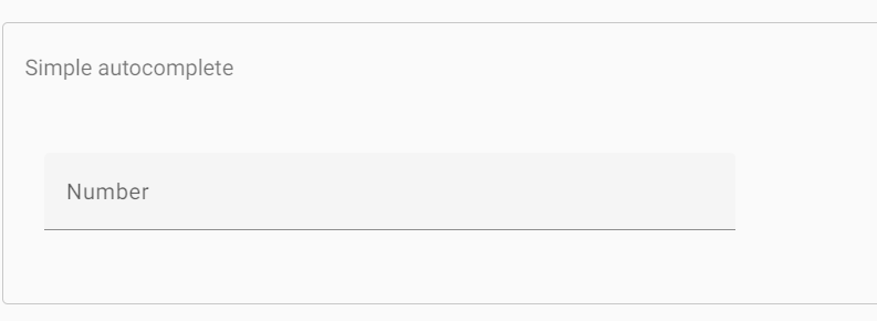
You can hide the dropdown button using the showDropDownButton property of AutoComplete. Also, you can use the placeholder property to set a placeholder in AutoComplete. In the below-shared sample, I have used the selectedIndex property to remove the default selection from the first item so that the placeholder can be seen. If you want to customize the dropdown created by AutoComplete then you can use the dropDownCssClass property of AutoComplete.Please refer to this API reference for more information on the above properties: https://www.grapecity.com/wijmo/api/classes/wijmo_input.autocomplete.html
Please refer to this sample for reference: https://jscodemine.grapecity.com/share/ZHvhMPx6wkmOiuODJowhWg/
Regards
Anirudh


