New Release! ComponentOne Studio Enterprise 2019 v1
We're pleased to announce the first major release of 2019—ComponentOne Studio Enterprise 2019 v1.
What's New?
Jump to your platform:
Bundles Changes for 2019 v1
ComponentOne Enterprise
ComponentOne Enterprise licenses that are purchased new or renewed in 2019 will now include ComponentOne Studio for Xamarin as well as Wijmo Core. Certain web controls for MVC (including OLAP, FlexSheet, MultiRow, and Financial Chart) will be moving to ComponentOne Ultimate. Both of these changes will be exclusive to licenses from 2019 onward.
C1 Ultimate
C1 Ultimate is moving to the $1995 price point and will now include advanced web controls for both MVC and JavaScript (including OLAP, FlexSheet, MultiRow, and Financial Chart). It continues to include priority support as well as Wijmo Enterprise.
ComponentOne Control Panel
We've added a new way to install, version, update, license, and maintain your ComponentOne libraries using the ComponentOne Control Panel. It also provides fast access to other samples, sales, and support for our software.
Visual Studio 2019 Support
All of our controls have been tested against and fully support Visual Studio 2019.
WinForms Updates
DataFilter
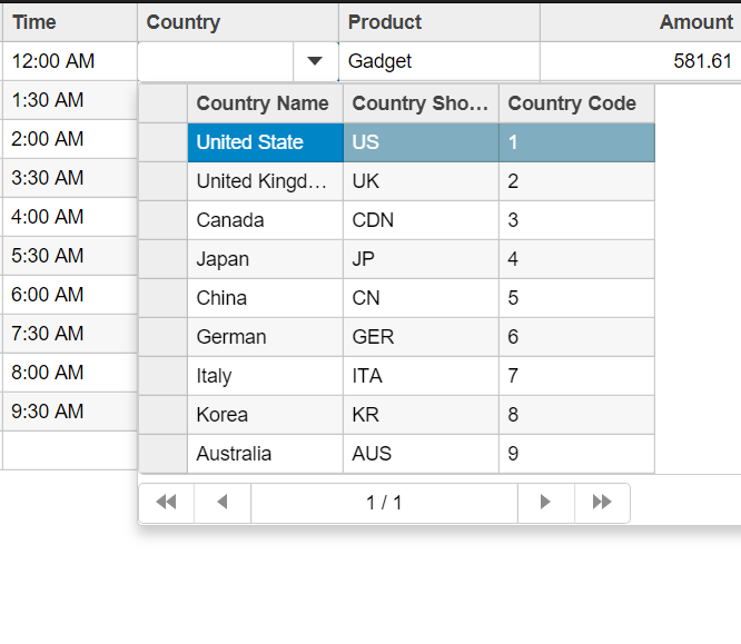
A powerful UI addition, the DataFilter provides an easy, ecommerce-like filter to accompany any data-aware control. It’s makes it easy to filter on criteria such as brand, price, time period, product name, or any other criteria represented in your data. It works with any data-aware control such as grids, lists, treeview, charts, or maps including standard out-of-the-box Microsoft controls. You can create filters from datasources, whether autogenerated or created manually.
This control allows users to filter data on the basis of the filter criteria or conditions. We released the beta of DataFilter in 2018v3. In 2019v1, the control has left beta and has additional features:
- It now automatically generates a checklist from the main data source when generating a filter.
- ToolTips support has been added.
- Added a class to support custom filters.
- A Calendar filter option has been added.

CollectionView
CollectionView provides a view for grouping, sorting, filtering and navigating a collection. With 2019 v1, this library is now available in WinForms edition.
BulletGraph
A BulletGraph is a type of linear gauge designed specifically for use in dashboards and information screens. It displays a single key measure to instantly signal whether a value is good, bad, or in some other state.

Data Slicer
The C1FlexPivotSlicer control provides a quick way to edit filters applied to PivotField objects. It allows the user to filter data based on values while also indicating the current filtering state.

Additional Enhancements
FlexPie now supports automatic data label’s placement to avoid overlapping much like FlexChart.
A Drawing Tools sample project for FlexChart has been added. It demonstrates actions such as adding/editing chart elements (e.g., annotations, series, trendline) via it's chart toolbar.
Input has a new CharHelper class provides methods to flexiblywork with Japanese character sets. For example, it can convert Katakana to Hiragana.
Command C1DockingManager.FloatingWindowOptions allows users to change the floating window border style and “close” button behaviour.
ASP.NET MVC
New Control - OLAP Slicer
The Slicer control provides a quick way to edit filters applied to PivotField objects. The Slicer provides buttons that a user an click to filter data based on values, and indicates the current filtering state. This makes it easy to understand what is shown in filtered PivotGrid and PivotChart controls.

Multi-Column Combo Sample
This extension control extends the cell dropdown to contain a pageable FlexGrid that displays multiple columns. The MultiColumn Combo control is helpful when users need to see multiple columns to make a decision. The dropdown is also pageable which allows the on-demand loading of data.
Control Wizard
The Control Wizard has been updated so that you can use OLAP, Tab, and DashboardLayout controls. It provides improved support for licensing and updating project resources and Web.config.

Additional Enhancements
FlexGrid adds support for Column Groups with a Column Header template that allows defining hierarchical column structures where some columns contain groups of columns.
The is now a Menu.subItemsPath property for the Menu control that allows the creation of hierarchical (multi-level) menus.
There is now has a ShowYearPicker property for Calendar and InputDate that causes the calendar to show a list of years when the user clicks the year calendar header.
Web API Data storage now supports cloud storages and their CRUD operations.
XAML Updates: WPF and UWP
SimplifiedRibbon

The Simplified Ribbon has been updated to use C1Icon (with support for image, font, or vector graphics can be used for buttons) and has been updated with improved theme support.
FlexGrid
The Full Text Filter behaves similarly to a search box. It allows you to highlight any matches that are contained within the FlexGrid. It gives you the option to match case, match whole word, match numbers, and treat spaces as an "And" operator.

FlexGrid now allows you to use C1Icon to also configure the GroupExpanded, GroupCollapsed, NewRow, DetailCollapsed, and DetailExpanded icons.
Additional Enhancements
FlexSheet adds the ability to update and delete comments, as well as VLOOKUP, HLOOKUP, and NOW functions. The FlexSheet.CalcEngine property is also now public and allows custom expressions.
C1Zip adds a new ZipEncoding class. The ZipEncoding.Encoding property specifies encoding used for zip entry names and comments and the default encoding is UTF8.
UWP
FlexGrid
Just like in WPF, a Full text filter (that behaves similarly to a search box) has been added for search box style filtering. It also allows filtering by matching case, number, and whole word, as well as treating spaces as an "And" operator.
FlexGrid now allows you to use C1Icon to also configure the GroupExpanded, GroupCollapsed, NewRow, DetailCollapsed, and DetailExpanded icons.
Xamarin
FlexGrid
New animations have been adding to the grid, including a rip animation when a user long presses over a column, as well as a flowing repositioning animation that triggers as the user drags a column or row to reorient it.
A new export feature allows you to easily export your data to text, CSV, and formatted HTML.
Gauges
Radial Gauge
Added a property that allows you to reverse the Radial Gauge’s direction. Rather than draw clockwise for 0 to 360, you can now draw counter clockwise from 360 to 0.
Input
All Input controls now support Right To Left (RTL Support). This is important for localizing certain languages, such as Arabic. Layout direction can be changed by setting FlowDirection for any Input control.
C1Icon
Added improved support for cross-platform vector graphics via C1PathIcon. Using this path, data can easily be resized or colored within your app.


Kelley Ricker