The Top 5 Wijmo FlexChart Features
Wijmo FlexChart allows you to visualize tabular data as JavaScript charts. It provides 80+ chart types and a variety of built-in features that allow you to customize how the data is presented and how users can interact with the chart.
There's a lot to talk about with FlexChart but let me tell you the top 5 things you should know and consider about this JavaScript control.
- ItemFormatter for Complete Customization
- AggregateSeries for Date Grouping
- Range Selectors for Interactive Zooming
- Annotations for More Customization
- Update Animation for Living Charts
ItemFormatter for Complete Customization
What is an item formatter? In Wijmo terms, the item formatter is what puts the "flexible" into FlexChart. Typically, with any data visualization library, the built-in features get you 70% of the way there to meet any requirement. But you need a flexible library to help you reach the full 100% of whatever a client may be looking for in their charts. The ItemFormatter is a function that executes for every individual data point giving you complete control over how the data point is rendered. It's used for common conditional formatting types of scenarios, but also for evolving the visualization beyond the out-of-box features and chart types. Let's look at several examples.
- Conditional Formatting – when you need to style just some of the data points based upon their values, you can use the ItemFormatter function to apply conditional styling.
See the Conditional Formatting demo.
- Styling Line Segments – similar to conditional formatting but for line charts, you can customize each segment of the line using the ItemFormatter callback function.
See the Custom Line Segments demo.
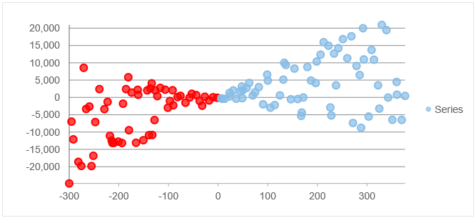
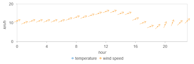
- Custom Drawn Data Points – The ItemFormatter can do more than just change the colors and line thickness, it can even draw new elements and thus change the chart type. This sample draws arrows to create a vector chart.
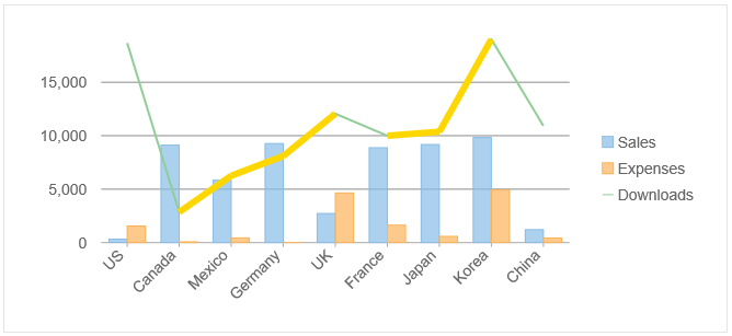
See the Custom Series demo. This sample draws inner bars to represent additional data values.
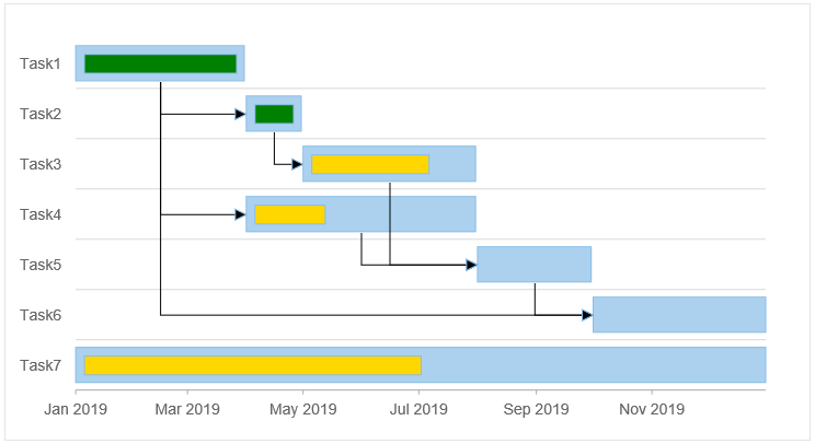
See the Gantt demo, and note that this demo also uses the rendered method for more customization.
- Custom Axis Labels - The Axis class also has an itemFormatter property that allows you to customize the content and appearance of specific labels along the axes. Check out the Custon Axis Labels demo to see how this works.
AggregateSeries for Grouping Dates
Dates are common to all business data, and typically we use date-centric data to visualize on charts for trend spotting and historical analysis. The custom AggregateSeries class makes working with dates simpler and more enjoyable because it handles the basic grouping and calendar-based logic for you. With FlexChart's AggregateSeries you can quickly group the data bound within the chart by common date measurements such as days, weeks, months, years, etc.
To see this feature in action, check out the AggregateSeries sample. Below is a quick explanation of how to implement it for your chart.
The AggregateSeries class is part of the wijmo.chart.research module. It can be added to FlexChart like any series. Set the groupAggregate and groupInterval properties to determine how the data will be aggregated and by which date interval.
import * as chart from '@grapecity/wijmo.chart';
import * as research from '@grapecity/wijmo.chart.research';

var myChart = new chart.FlexChart('#myChart');
myChart.beginUpdate();
myChart.itemsSource = getAppData();

// create aggregate data series summed by Year
var series = new research.AggregateSeries();
series.name = 'Sales';
series.binding = 'sales';
series.bindingX = 'date';
series.groupAggregate = 'Sum';
series.groupInterval = 'YYYY';
myChart.series.push(series);
myChart.endUpdate();
The groupAggregate property supports Sum, Avg (average), Cnt (count), Max, Min, Rng (range), Std (standard deviation), StdPop (standard deviation population), Var (variance), and VarPop (variance population).
The groupInterval property supports several date formats including DD (day), WW (week), MM (month), and YYYY (year).
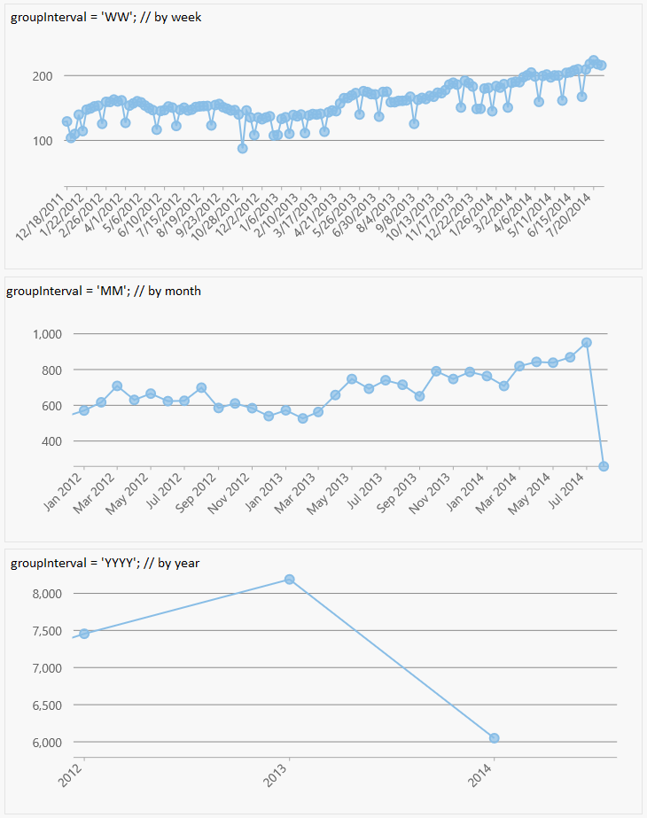
This built-in functionality makes it easy to switch between groupings by effortlessly switching the view from years to months, to weeks and so on. The AggregateSeries class also support automatic date intervals, which is ideal when the scope of the data set is unknown prior to data binding. To see how this feature works check out Grouping and Drill-down the documentation.
Range Selectors for Interactive Zooming
The range selector feature allows you to provide interactivity in a way that most users will recognize and appreciate. It's based on the popular visualization technique used by Google Finance charts. Other "zooming" techniques are common in charts, but they don’t offer the precise and intuitive zooming experience that the range selectors provide.
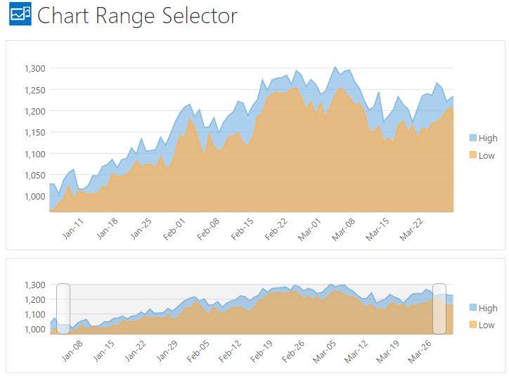
Range selectors have become one of our most popular chart features. Here's a live demo of range selection and below is a quick explanation of how to implement it on your chart.
- First, you should configure two FlexCharts: one with the full data set on the bottom and the top chart set to a range which is controlled by the range selector (more on that in next steps).
- Second, create a RangeSelector object using the bottom chart as the constructor's parameter.
- Third, listen to the RangeSelector's rangeChanged event to update the top chart's X-axis range.
Below is a code snippet taken from the documentation on range selectors.
import * as chart from '@grapecity/wijmo.chart';
import * as interaction from '@grapecity/wijmo.chart.interaction';

// create the regular chart
var regularChart = new chart.FlexChart('#regularChart');

// create the second chart for the range selector
var secondChart = new chart.FlexChart('#secondChart');

// create RangeSelector
var rangeSelector = new interaction.RangeSelector(secondChart, {
    max: regularChart.itemsSource[0].date.valueOf(), // now
    min: regularChart.itemsSource[30].date.valueOf(), // a month ago
        minScale: .05, // restrict selection to between 5% and
        maxScale: .75, // 75% of the data
    rangeChanged: function(s, e) {
        regularChart.axisX.min = s.min;
      regularChart.axisX.max = s.max;
    }
});
Annotations for More Customization
Sticking with the flexible theme of FlexChart, the annotations are another feature that prove the true value of the control. The annotation feature is basically a "layer of stuff" that you can stick all over the chart. Of course, they're used for adding standard annotation labels to the chart. But if you need to customize the chart you can get creative and use the annotations for other features such as reference lines and alarm zones.
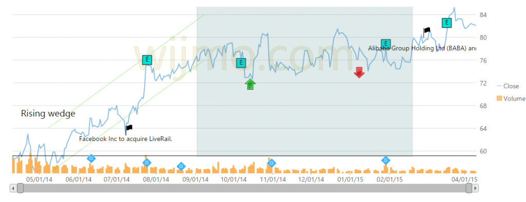
Supported types of annotations: Rectangle, Square, Circle, Ellipse, Line, Polygon, Image, Text. Here are some examples of annotations added to FlexChart.
Adding annotations to FlexChart follows this straight-forward approach:
- Create an AnnotationLayer
- Add annotations to the annotation layer
- For each annotation, set its attachment property to determine how it's attached.
- For each annotation, set its pointIndex or seriesIndex property to determine where it's attached.
For a full code example, check out the Annotations topic in the documentation. Or, check out any of the following live demos.
Update Animation for Living Charts
If you're using a data visualization library then you probably aren't interested in programming animation logic yourself, so having a library with built-in animation is a must. Wijmo FlexChart has loading and update animation. What's great about the update animation is that you don't realize you need it until you have it, and then you can't live without it. With loading animation it's great but it's also over quickly and the user moves on. With update animation applied to a live chart, the update animation delivers over and over.
Play around with the Animation live demo. (Note: to see the update animation, click on Add & Remove buttons).
How does it work? It's handled by the Wijmo CollectionView. Since FlexChart uses the CollectionView class as its data source, any changes made to the data will be automatically reflected on the chart. This CollectionView is exposed by the collectionView property. You can also add and remove points from this collection to see it updated on the chart. Check out the Animation topic in the documentation to learn more.
Why is update animation important? The FlexChart is smart to be able to animate from previous or current values to the new values, so data points can literally glide across your screen as they represent a change in data over time (or whatever you're displaying). Check out these additional reads on animation with FlexChart and mobile development.

Greg Lutz