Skip to main content Skip to footer

Customizing the Designer in SpreadJS, a JavaScript Spreadsheet Component

The SpreadJS Designer Component is the perfect solution to your spreadsheet UI needs. As an add-on to the SpreadJS product, you can quickly implement your very own interactive UI to give your users the power to customize and interact with your workbooks.

Out-of-the-box, this UI can be easily connected to SpreadJS to provide all the expected functionality, but in some cases, you might need more than just the basic features. Thankfully, the SpreadJS Designer Component is fully customizable, and this blog will show you how you can customize some of those features. We also explore these features in the video below:

Download the sample used in this blog. 

Setup

Before customizing the Designer Component, we can first create an HTML page with the necessary references, and initialize the designer:

<!DOCTYPE html>
<html>

<head>
    <meta charset="utf-8" />
    <meta http-equiv="X-UA-Compatible" content="IE=edge" />
    <title>SpreadJS Designer</title>
    <link href="./node_modules/@grapecity/spread-sheets/styles/gc.spread.sheets.excel2013white.css" rel="stylesheet" type="text/css" />
    <link href="./lib/css/gc.spread.sheets.designer.15.0.2.min.css" rel="stylesheet" type="text/css">
    <link href="./custom.css" rel="stylesheet" type="text/css">

    <script type="text/javascript" src="./node_modules/@grapecity/spread-sheets/dist/gc.spread.sheets.all.min.js"></script>
    <script src="./node_modules/@grapecity/spread-sheets-charts/dist/gc.spread.sheets.charts.min.js"></script>
    <script src="./node_modules/@grapecity/spread-sheets-shapes/dist/gc.spread.sheets.shapes.min.js"></script>

    <script src="./node_modules/@grapecity/spread-sheets-print/dist/gc.spread.sheets.print.min.js"></script>
    <script src="./node_modules/@grapecity/spread-sheets-barcode/dist/gc.spread.sheets.barcode.min.js"></script>
    <script src="./node_modules/@grapecity/spread-sheets-pdf/dist/gc.spread.sheets.pdf.min.js"></script>
    <script src="./node_modules/@grapecity/spread-sheets-pivot-addon/dist/gc.spread.pivot.pivottables.min.js"></script>
    <script src="./node_modules/@grapecity/spread-excelio/dist/gc.spread.excelio.min.js"></script>
    <script src="./node_modules/@grapecity/spread-sheets-tablesheet/dist/gc.spread.sheets.tablesheet.min.js"></script>

    <script src="./lib/scripts/gc.spread.sheets.designer.resource.en.15.0.2.min.js"></script>
    <script src="./lib/scripts/gc.spread.sheets.designer.all.15.0.2.min.js"></script>

    <script src="./custom-file-menu-panel.js"></script>
    <script src="./custom-dialog.js"></script>
    <script src="./enable-disable-dialog.js"></script>
    <script src="./customSidePanel.js"></script>
    <script src="./app.js"></script>

    <script>
        window.onload = function () {
            var designer = new GC.Spread.Sheets.Designer.Designer(document.getElementById("designerHost"), config);
            spread = designer.getWorkbook();
        }
    </script>
</head>

<body>
    <div id="designerHost" style="width:100%; height:98vh"></div>
</body>

</html>

Tabs

Add a New Tab

The SpreadJS Designer Component has all the standard tabs, including Home, Insert, Formulas, Data, View, and Settings. To add a new tab, you must first get the config of the Designer Component:

var config = GC.Spread.Sheets.Designer.DefaultConfig;

There are a few ways to edit the returned data structure. You could manually edit the config for the designer, but that requires making those same changes every time there is a new release. The easiest way is to edit the config dynamically, in this case adding a tab to the ribbon with the correct format:

// Add a tab
config.ribbon.push({
    "id" : "contactUs",
    "text": "Contact Us",
    "buttonGroups": [
        {
            "label": "Contact sales at (+1) 412-681-4343 or us.sales@grapecity.com to request temporary deployment authorization.",
            "commandGroup": {}    
        }   
    ]
});

This will add a new tab called "Contact Us" to the ribbon:

contact

Buttons and Drop-Downs

Buttons and drop-down menus are just a couple of the essential interactive elements you can add to tabs in the ribbon, and they are also simple to add.

Add a New Button

When creating a button, you must add a new command to the command map for the ribbon. This command has a few different properties that have to be defined:

config.commandMap = {
    // Custom button functionality
    Welcome: {
        title: "Welcome",
        text: "Welcome",
        iconClass: "ribbon-button-welcome",
        bigButton: "true",
        commandName: "Welcome",
        execute: async (context, propertyName, fontItalicChecked) => {
            alert('Welcome to new designer.');
        }
    }
}

The command can then be used when adding a new button to a new section in a tab using the buttonGroups array:

config.ribbon[0].buttonGroups.unshift({
    "label": "NewDesigner",
    "thumbnailClass": "welcome",
    "commandGroup": {
        "children": [
            {
                "direction": "vertical",
                "commands": [
                    "Welcome"
                ]
            }
        ]
    }
});

The button will be added to the ribbon, like so:

button

Edit an Existing Drop-Down

Existing buttons and drop-down menus can also be changed. For example, we can remove and add a new font to the font family drop-down. This requires getting the specific command for the font family drop-down and then adding and drawing from the array using standard JavaScript array manipulation:

var fontFamilyCmd = GC.Spread.Sheets.Designer.getCommand("fontFamily");
var customFont = [
    { value: "Test", text: "Test" }
];
fontFamilyCmd.dropdownList = customFont.concat(fontFamilyCmd.dropdownList);
var index = fontFamilyCmd.dropdownList.map((item) => item.text).indexOf("Arial");
if (index > -1) {
    fontFamilyCmd.dropdownList.splice(index, 1);
}

edit

Dialogs

There are many different dialogs within the SpreadJS Designer Component, and it supports creating custom dialogs for further integration into your specific application.

Add a New Dialog

The easiest way to create a dialog in the Designer Component is to create a template in a separate file and use the registerTemplate function. This template needs to have a name, a title, and content, and the content is just an object array with different types. In this example, we can make a dialog for inserting a signature into the SpreadJS instance:

var insertSignatureTemplate = {
    title: "Signature Dialog",
    content:
    [
        {
            type: "FlexContainer",
            children: [
                {
                    type: "TextBlock",
                    margin: "5px -4px",
                    text: "Insert Range"
                },
                {
                    type: "RangeSelect",
                    title: "Select Range",
                    absoluteReference: true,
                    needSheetName: false,
                    margin: "5px -5px"
                }
            ]
        }
    ]
};
// Register dialog template instance using registerTemplate
GC.Spread.Sheets.Designer.registerTemplate("insertSignatureTemplate", insertSignatureTemplate);

Now that the dialog template is created, we can add it to the commandMap of the config:

config.commandMap = {
    // Custom dialog
    insertSignatureTemplate: {
        title: "Insert Signature",
        text: "Insert Signature",
        commandName: "insertSignatureTemplate",
        visibleContext: "ClickRowHeader",
        execute: () => {
            // Same template name defined in the JS file
            GC.Spread.Sheets.Designer.showDialog("insertSignatureTemplate");
        }
    }
}

Edit an Existing Dialog

In addition to adding new dialogs to the Designer, you can also edit existing dialogs. The entire dialog could be replaced, but you could also get the existing dialog template, change it, and then register it again with the same name, effectively overwriting the existing template:

var formatCellsTemplate = GC.Spread.Sheets.Designer.getTemplate("formatDialogTemplate");
formatCellsTemplate.title = "Custom";
formatCellsTemplate.content[0].children[4].children[0].children[0].type ='ColorPicker';
formatCellsTemplate.content[0].children[4].children[0].children[0].bindingPath = 'fillTabOption.backColor';
GC.Spread.Sheets.Designer.registerTemplate("formatDialogTemplate", formatCellsTemplate);

Disable Items in a Dialog

In addition to adding and removing items in a dialog, you can also programmatically disable elements by utilizing those elements' “enableWhen” property. To show this, we can make another custom dialog template in a separate JS file:

var enableDisableTemplate = {
    title: "mytemplate",
    content: [{
        type: "ColumnSet",
        children: [{
            type: "Column",
            children: [{
                type: "RangeSelect",
                title: "Select Range",
                enableWhen: 'selectType=range',
                bindingPath: "targetRange"
            }, {
                type: "TextEditor",
                enableWhen: 'selectType=source',
                bindingPath: "firstColumn"
            }, {
                type: "TextEditor",
                enableWhen: 'selectType=source',
                bindingPath: "firstRow"
            }, {
                type: "TextEditor",
                enableWhen: 'selectType=source',
                bindingPath: "lastColumn"
            }, {
                type: "TextEditor",
                enableWhen: 'selectType=source',
                bindingPath: "lastRow"
            }, {
                type: "Radio",
                columnCount: 1,
                items: [
                    {
                        text: "Range Select:",
                        value: "range"
                    },
                    {
                        text: "Source Column:",
                        value: 'source'
                    }
                ],
                bindingPath: "selectType"
            },]
        }]
    }]
};

GC.Spread.Sheets.Designer.registerTemplate("enableDisableTemplate", enableDisableTemplate);

Just as before, we can add this to the command map: To open this dialog, we can add a button to a tab as well:

config.ribbon[0].buttonGroups.splice(1, 0, {
    "label": "ShowTemplate",
    "thumbnailClass": "welcome",
    "commandGroup": {
        "children": [
            {
                "direction": "vertical",
                "commands": [
                    "enableDisableTemplate"
                ]
            }
        ]
    }
});

disable

Clicking on this button will show the dialog:

dialog

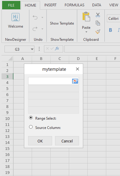
Clicking on the radio buttons will enable and disable elements in a dialog:

button

Disabling Items in UI Components

Some dialogs contain entire UI components that can't be edited in some cases. For example, the Border tab in the Format Cells Dialog only has two children in the array:

children: Array(2)
    0:
        bindingPath: "borderTabOption"
        type: "BorderEditor"
    1:
        text: "The selected border style can be applied by clicking the presets, preview diagram, or the buttons above"
        type: "textBlock"

This structure corresponds to this UI:

ui

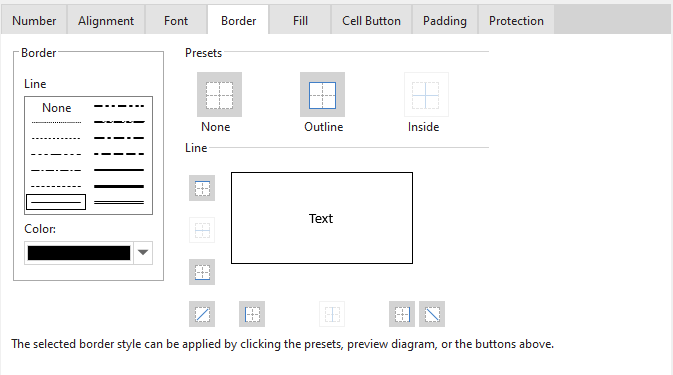
As you can see, the text child in that array is the text at the bottom of the dialog, and the rest above it is of the type "BorderEditor.” In cases like this, you could replace that entire editor with your controls, but sometimes you might want to hide specific items in that editor. This can be done utilizing CSS code:

<style>
    div[buttontype="diagonalUpLine"] {
        display: none !important
        }

    div[buttontype="diagonalDownLine"] {
        display: none !important
    }
</style>

With this code added we can see that the diagonalUpLine and diagonalDownLine buttons are not showing:

border

Context Menus

Context menus appear in the Designer when a user right-clicks in the spreadsheet, and the options available change depending on what part of the spreadsheet is clicked.

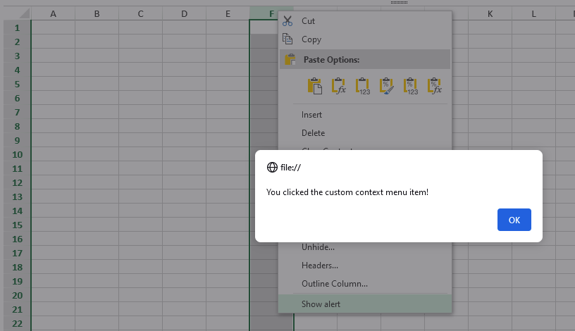
Add a New Context Menu Item

To add a new item to the context menu, we first need to add it to the contextMenu array in the config, in this case, an item called "showAlert":

config.contextMenu.push(
    "showAlert"
);

Once that is added, we can define the command in the commandMap. This new command should have the text that will show in the context menu, the location where the context menu with this item should appear (visibleContext), and the functionality that should execute when clicked:

config.commandMap = {
    showAlert: {
        text: "Show alert",
        commandName: "showAlert",
        visibleContext: "ClickColHeader",
        execute: () =>{
            alert("You clicked the custom context menu item!");
        }
    }
}

alert

custom

Side Panel

In addition to dialogs and tabs, we can create custom side panels that provide extra functionality that might not fit in a tab. In this case, we can create a custom side panel for shapes that includes different shape properties that can be changed. Having a side panel also lets us edit the shape without switching the focus from the SpreadJS instance, like with dialogs.

We can write the code for most of this new side panel in a separate JS file to simplify things. To start, as usual, we can create a template for this side panel, which is just a JS object with specific properties:

var pictureTemplate = {
    "templateName": "pictureOptionTemplate",
    "content": [
        { "type": "TextBlock", "style": "margin:10px;font-size: 20px;font-weight: lighter;color: #08892c", "text": "Image Property" },

        {
            "type": "Container",
            "children": [
                {
                    "type": "FlexContainer",
                    "children": [
                        {
                            "type": "Container",
                            "visibleWhen": "series.selectedValue=1",
                            "children": [
                                {
                                    "type": "Container",
                                    "visibleWhen": "",
                                    "children": [
                                        {
                                            "type": "TabControl",
                                            "id": "c_tabControl",
                                            "className": "tab-control",
                                            "children": [
                                                {
                                                    "key": "fillAndLine",
                                                    "tip": "Fill and line",
                                                    "iconClass": "FillLine",
                                                    "selectedClass": "FillLine-selected",
                                                    "children": [
                                                        {
                                                            "type": "CollapsePanel",
                                                            "children": [
                                                                {
                                                                    "key": "fill",
                                                                    "text": "Fill",
                                                                    "active": true,
                                                                    "children": [
                                                                        {
                                                                            "type": "Container",
                                                                            "margin": "10px 5px",
                                                                            "children": [
                                                                                {
                                                                                    "type": "ColumnSet",
                                                                                    "margin": "5px 0px",
                                                                                    "children": [
                                                                                        {
                                                                                            "type": "Column",
                                                                                            "children": [
                                                                                                {
                                                                                                    "type": "Radio",
                                                                                                    "bindingPath": "pictureFill",
                                                                                                    "items": [
                                                                                                        {
                                                                                                            "text": "No Fill",
                                                                                                            "value": 0
                                                                                                        },
                                                                                                        {
                                                                                                            "text": "Solid Fill",
                                                                                                            "value": 1
                                                                                                        }
                                                                                                    ]
                                                                                                }
                                                                                            ]
                                                                                        }
                                                                                    ]
                                                                                },
                                                                                {
                                                                                    "type": "ColumnSet",
                                                                                    "visibleWhen": "pictureFill=1",
                                                                                    "margin": "5px 0px",
                                                                                    "children": [
                                                                                        {
                                                                                            "type": "Column",
                                                                                            "width": "110px",
                                                                                            "children": [
                                                                                                {
                                                                                                    "type": "TextBlock",
                                                                                                    "text": "BackgroundColor"
                                                                                                }
                                                                                            ]
                                                                                        },
                                                                                        {
                                                                                            "type": "Column",
                                                                                            "width": "150px",
                                                                                            "children": [
                                                                                                {
                                                                                                    "type": "ColorComboEditor",
                                                                                                    "bindingPath": "backColor"
                                                                                                }
                                                                                            ]
                                                                                        }
                                                                                    ]
                                                                                }
                                                                            ]
                                                                        }
                                                                    ]
                                                                },
                                                                {
                                                                    "key": "line",
                                                                    "active": true,
                                                                    "text": "Line",
                                                                    "children": [
                                                                        {
                                                                            "type": "Container",
                                                                            "margin": "10px 5px",
                                                                            "children": [
                                                                                {
                                                                                    "type": "ColumnSet",
                                                                                    "margin": "5px 0px",
                                                                                    "children": [
                                                                                        {
                                                                                            "type": "Column",
                                                                                            "children": [
                                                                                                {
                                                                                                    "type": "Radio",
                                                                                                    "bindingPath": "pictureLine",
                                                                                                    "items": [
                                                                                                        {
                                                                                                            "text": "No Line",
                                                                                                            "value": 0
                                                                                                        },
                                                                                                        {
                                                                                                            "text": "Solid Line",
                                                                                                            "value": 1
                                                                                                        }
                                                                                                    ]
                                                                                                }
                                                                                            ]
                                                                                        }
                                                                                    ]
                                                                                },
                                                                                {
                                                                                    "type": "ColumnSet",
                                                                                    "visibleWhen": "pictureLine=1",
                                                                                    "margin": "5px 0px",
                                                                                    "children": [
                                                                                        {
                                                                                            "type": "Column",
                                                                                            "width": "110px",
                                                                                            "children": [
                                                                                                {
                                                                                                    "type": "TextBlock",
                                                                                                    "text": "Color"
                                                                                                }
                                                                                            ]
                                                                                        },
                                                                                        {
                                                                                            "type": "Column",
                                                                                            "width": "150px",
                                                                                            "children": [
                                                                                                {
                                                                                                    "type": "ColorComboEditor",
                                                                                                    "bindingPath": "borderColor"
                                                                                                }
                                                                                            ]
                                                                                        }
                                                                                    ]
                                                                                },
                                                                                {
                                                                                    "type": "ColumnSet",
                                                                                    "visibleWhen": "pictureLine=1",
                                                                                    "margin": "5px 0px",
                                                                                    "children": [
                                                                                        {
                                                                                            "type": "Column",
                                                                                            "width": "110px",
                                                                                            "children": [
                                                                                                {
                                                                                                    "type": "TextBlock",
                                                                                                    "text": "Width"
                                                                                                }
                                                                                            ]
                                                                                        },
                                                                                        {
                                                                                            "type": "Column",
                                                                                            "width": "150px",
                                                                                            "children": [
                                                                                                {
                                                                                                    "type": "NumberEditor",
                                                                                                    "bindingPath": "borderWidth",
                                                                                                    "min": 1
                                                                                                }
                                                                                            ]
                                                                                        }
                                                                                    ]
                                                                                }
                                                                            ]
                                                                        }
                                                                    ]
                                                                }
                                                            ]
                                                        }
                                                    ]
                                                },
                                                {
                                                    "key": "size",
                                                    "tip": "size",
                                                    "iconClass": "Size",
                                                    "selectedClass": "Size-selected",
                                                    "children": [
                                                        {
                                                            "type": "CollapsePanel",
                                                            "children": [
                                                                {
                                                                    "key": "size",
                                                                    "text": "Size",
                                                                    "active": true,
                                                                    "children": [
                                                                        {
                                                                            "type": "Container",
                                                                            "margin": "10px 5px",
                                                                            "children": [
                                                                                {
                                                                                    "type": "ColumnSet",
                                                                                    "margin": "5px 0px",
                                                                                    "children": [
                                                                                        {
                                                                                            "type": "Column",
                                                                                            "width": "110px",
                                                                                            "children": [
                                                                                                {
                                                                                                    "type": "TextBlock",
                                                                                                    "text": "Height"
                                                                                                }
                                                                                            ]
                                                                                        },
                                                                                        {
                                                                                            "type": "Column",
                                                                                            "width": "150px",
                                                                                            "children": [
                                                                                                {
                                                                                                    "type": "NumberEditor",
                                                                                                    "bindingPath": "size.height",
                                                                                                    "ruleType": "Defaults"
                                                                                                }
                                                                                            ]
                                                                                        }
                                                                                    ]
                                                                                },
                                                                                {
                                                                                    "type": "ColumnSet",
                                                                                    "margin": "5px 0px",
                                                                                    "children": [
                                                                                        {
                                                                                            "type": "Column",
                                                                                            "width": "110px",
                                                                                            "children": [
                                                                                                {
                                                                                                    "type": "TextBlock",
                                                                                                    "text": "Width"
                                                                                                }
                                                                                            ]
                                                                                        },
                                                                                        {
                                                                                            "type": "Column",
                                                                                            "width": "150px",
                                                                                            "children": [
                                                                                                {
                                                                                                    "type": "NumberEditor",
                                                                                                    "bindingPath": "size.width",
                                                                                                    "ruleType": "Defaults"
                                                                                                }
                                                                                            ]
                                                                                        }
                                                                                    ]
                                                                                }
                                                                            ]
                                                                        }
                                                                    ]
                                                                },
                                                                {
                                                                    "key": "properties",
                                                                    "text": "Property",
                                                                    "active": true,
                                                                    "children": [
                                                                        {
                                                                            "type": "Container",
                                                                            "margin": "10px 5px",
                                                                            "children": [
                                                                                {
                                                                                    "type": "ColumnSet",
                                                                                    "margin": "5px 0px",
                                                                                    "children": [
                                                                                        {
                                                                                            "type": "Column",
                                                                                            "children": [
                                                                                                {
                                                                                                    "type": "Radio",
                                                                                                    "bindingPath": "properties.moveSizeRelationship",
                                                                                                    "items": [
                                                                                                        {
                                                                                                            "text": "dynamic move and size",
                                                                                                            "value": 0
                                                                                                        },
                                                                                                        {
                                                                                                            "text": "dynamic move but lock size",
                                                                                                            "value": 1
                                                                                                        },
                                                                                                        {
                                                                                                            "text": "lock move and size",
                                                                                                            "value": 2
                                                                                                        }
                                                                                                    ]
                                                                                                }
                                                                                            ]
                                                                                        }
                                                                                    ]
                                                                                },
                                                                                {
                                                                                    "type": "ColumnSet",
                                                                                    "margin": "5px 0px",
                                                                                    "children": [
                                                                                        {
                                                                                            "type": "Column",
                                                                                            "width": "110px",
                                                                                            "children": [
                                                                                                {
                                                                                                    "type": "CheckBox",
                                                                                                    "text": "Lock",
                                                                                                    "bindingPath": "properties.locked"
                                                                                                }
                                                                                            ]
                                                                                        }
                                                                                    ]
                                                                                },
                                                                                {
                                                                                    "type": "ColumnSet",
                                                                                    "margin": "5px 0px",
                                                                                    "children": [
                                                                                        {
                                                                                            "type": "Column",
                                                                                            "width": "150px",
                                                                                            "children": [
                                                                                                {
                                                                                                    "type": "CheckBox",
                                                                                                    "text": "Allow Resize",
                                                                                                    "bindingPath": "properties.allowResize"
                                                                                                }
                                                                                            ]
                                                                                        }
                                                                                    ]
                                                                                },
                                                                                {
                                                                                    "type": "ColumnSet",
                                                                                    "margin": "5px 0px",
                                                                                    "children": [
                                                                                        {
                                                                                            "type": "Column",
                                                                                            "width": "150px",
                                                                                            "children": [
                                                                                                {
                                                                                                    "type": "CheckBox",
                                                                                                    "text": "AllowMove",
                                                                                                    "bindingPath": "properties.allowMove"
                                                                                                }
                                                                                            ]
                                                                                        }
                                                                                    ]
                                                                                }
                                                                            ]
                                                                        }
                                                                    ]
                                                                }
                                                            ]
                                                        }
                                                    ]
                                                }
                                            ]
                                        }
                                    ]
                                }
                            ]
                        }
                    ]
                }
            ]
        }

    ]
}

We then need to register this new template in the designer:

GC.Spread.Sheets.Designer.registerTemplate("pictureOptionTemplate", pictureTemplate)

Now we can write the commands needed to add functionality to this template. In this case, we need two different functions: "execute,” which is the code that runs when the user clicks on different buttons in the template, and "getState,” which gets the properties of the currently selected shape to fill in the template:

function getSelectedPicture(sheet) {
    let allPictures = sheet.pictures.all();
    for (let i = 0; i < allPictures.length; i++) {
        let picture = allPictures[i];
        if (picture.isSelected()) {
            return picture;
        }
    }
}

var sidePanelsPictureCommands = {
    pictureOptionPanel: {
        commandName: "pictureOptionPanel",
        enableContext: "AllowEditObject",
        visibleContext: "pictureSelected && !pictureAltTextPanel_Visible",
        execute: function (context, propertyName, newValue) {
            if (!propertyName) {
                return;
            }
            let sheet = context.Spread.getActiveSheet();
            let activePicture = getSelectedPicture(sheet);
            switch (propertyName) {
                case "pictureFill":
                    if (newValue === 0) {
                        activePicture.backColor(null)
                    }
                    else {
                        activePicture.backColor("white")
                    }
                    break;
                case "pictureLine":
                    if (newValue === 0) {
                        activePicture.borderStyle("none")
                    }
                    else {
                        activePicture.borderStyle("double")
                    }
                    break;
                default:
                    Reflect.apply(activePicture[propertyName], activePicture, [newValue])
                    break;
            }
        },
        getState: function (context) {
            let sheet = context.Spread.getActiveSheet();
            let activePicture = getSelectedPicture(sheet);
            const pictureStatus = {
                pictureFill: 0,
                backColor: "",
                pictureLine: 0,
                borderWidth: 0,
                borderColor: ""
            };
            if (activePicture) {

                for (let key in pictureStatus) {
                    switch (key) {
                        case "backColor":
                            let backColor = activePicture.backColor();
                            if (backColor) {
                                pictureStatus.backColor = backColor;
                                pictureStatus.pictureFill = 1;
                            } else {
                                pictureStatus.backColor = "#000000";
                                pictureStatus.pictureFill = 0;
                            }
                            break;
                        case "borderWidth":
                            pictureStatus.borderWidth = activePicture.borderWidth();
                            break;
                        case "borderColor":
                            pictureStatus.borderColor = activePicture.borderColor();
                            break;
                    }
                }

                let borderStyle = activePicture.borderStyle();
                if (borderStyle && borderStyle !== "none") {
                    pictureStatus.pictureLine = 1
                } else {
                    pictureStatus.pictureLine = 0
                }
            }
            return pictureStatus;
        },
    }
}

Now that we have the template and the corresponding command, we can create a configuration just for this side panel that we can refer to. This will also include some other properties, including the position and width of the side panel:

var sidePanelsPictureConfig =
{
    "position": "right",
    "width": "315px",
    "command": "pictureOptionPanel",
    "uiTemplate": "pictureOptionTemplate",
    "showCloseButton": true
}

Back in the original HTML file, we can use that config we defined to add this new side panel to the list of side panels already in the configuration for the Designer:

// Add a new side panel
config.sidePanels.push(sidePanelsPictureConfig);
Object.assign(config.commandMap, sidePanelsPictureCommands);

Now, when a user clicks on a shape in the SpreadJS instance, our new side panel will open:

panel

Status Bar

We can also customize the status bar, which is simply getting the status bar control and adding an item to it. The status bar has a class name of "gc-statusBar,” so we can use that when getting the control:

var statusBar = GC.Spread.Sheets.StatusBar.findControl(document.getElementsByClassName("gc-statusBar"));
var spanItem = new GC.Spread.Sheets.StatusBar.StatusItem('spanItem', {menuContent: 'Show Contact', value: 'Contact: us.sales@grapecity.com'});
statusBar.add(spanItem);

File Menu

Unlike the other tabs and dialogs in the SpreadJS Designer Component, the File Menu covers the whole window when opened. However, it still just utilizes a template, which we can overwrite to add our own options. In this case, we can create a separate JS file for this:

var fileMenuTemplate = GC.Spread.Sheets.Designer.getTemplate(
    GC.Spread.Sheets.Designer.TemplateNames.FileMenuPanelTemplate
);
addCustomItem(fileMenuTemplate);

GC.Spread.Sheets.Designer.registerTemplate(
    GC.Spread.Sheets.Designer.TemplateNames.FileMenuPanelTemplate,
    fileMenuTemplate
);


function addCustomItem(template) {
    var listContainer =
        template["content"][0]["children"][0]["children"][0]["children"][0][
        "children"
        ][1];
    listContainer.items.push({ text: "Custom Actions", value: "CustomItem" });

    var listDisplayContainer = template["content"][0]["children"][0]["children"][1];
    listDisplayContainer.children.push({
        type: "Container",
        visibleWhen: "activeCategory_main=CustomItem",
        children: [
            {
                type: "TextBlock",
                margin: "50px 0 15px 50px",
                text: "Custom Actions",
                style: "font-size:36px;line-height:80px"
            },
            {
                type: "ColumnSet",
                margin: "0 0 0 50px",
                children: [
                    {
                        type: "Column",
                        children: [
                            {
                                type: "List",
                                className: "file-menu-list",
                                items: [
                                    {
                                        text: "Print",
                                        value: "print"
                                    },
                                    {
                                        text: "Action 1",
                                        value: "action_1"
                                    },
                                    {
                                        text: "Action 2",
                                        value: "action_2"
                                    }
                                ],
                                bindingPath: "custom_item"
                            }
                        ],
                        width: "350px"
                    },
                    {
                        type: 'Container',
                        children: [
                            {
                                "type": "Button",
                                "margin": "20px 50px",
                                "text": "Printing",
                                "width": 120,
                                "height": 120,
                                "iconClass": "icon-common",
                                "bindingPath": "custom_item_print",
                                "iconPosition": "top"
                            }
                        ],
                        visibleWhen: 'custom_item=print'
                    },
                    {
                        type: 'Container',
                        children: [
                            {
                                "type": "Button",
                                "margin": "20px 50px",
                                "text": "Action 1",
                                "width": 120,
                                "height": 120,
                                "iconClass": "icon-common",
                                "bindingPath": "custom_item_action_1",
                                "iconPosition": "top"
                            }
                        ],
                        visibleWhen: 'custom_item=action_1'
                    },
                    {
                        type: 'Container',
                        children: [
                            {
                                "type": "Button",
                                "margin": "20px 50px",
                                "text": "Action 2",
                                "width": 120,
                                "height": 120,
                                "iconClass": "icon-common",
                                "bindingPath": "custom_item_action_2",
                                "iconPosition": "top"
                            }
                        ],
                        visibleWhen: 'custom_item=action_2'
                    }
                ]
            }
        ]
    });
}

Once the template is defined, we can then define the function that executes when the user clicks on the File tab, essentially defining what our new options do when clicked:

var fileMenuPanelCommand = GC.Spread.Sheets.Designer.getCommand(GC.Spread.Sheets.Designer.CommandNames.FileMenuPanel);
var oldExecuteFn = fileMenuPanelCommand.execute;
fileMenuPanelCommand.execute = function (context, propertyName, newValue) {
    oldExecuteFn.apply(this, arguments);
    switch (propertyName) {
        case 'custom_item_print':
            var workbook = context.getWorkbook();
            workbook.print();
            break;
        case 'custom_item_action_1':
            alert('do something for action 1')
            break;
        case 'custom_item_action_2':
            alert('do something for action 2')
            break;
    }
}

These are just a few of the different ways you can customize the SpreadJS Designer Component, and there is a lot more functionality that can be changed.

This blog should help provide a foundation for fully customizing the Designer to fit the needs of your users.

To give these customizations a try, be sure to download a trial of SpreadJS today!

comments powered by Disqus