Introducing MultiSelectListBox Control for ASP.NET MVC
GrapeCity's ComponentOne 2020 v2 release introduces the MultiSelectListBox control for ASP. NET MVC, an advanced ListBox control with a corresponding checkbox for each item in a list. Users select or unselect multiple items by checking or unchecking the checkbox without using the shift or ctrl keys. The MultiSelectListBox control also includes filtering and a select all feature.
This post outlines the steps for creating the control and highlights the new features.
Configuring the MultiSelectListBox Control for ASP. NET Applications
-
Create a new ASP. NET MVC application
- Use the ComponentOne ASP. NET Core MVC Application (.Net Core) template
- Choose a standard application (Refer to the documentation for details on configuring the project)
-
Add a model and controller to the project using the steps described here
- Add the following code to the corresponding View to add a MultiSelectListBox control
@{List<string> cities = ViewBag.Cities;}<

<div id="multiSelectList" style="width:100%;max-width:400px;height:530px; margin:20px;"></div>

<c1-multi-select-list-box id="multiSelectList">
      <c1-items-source source-collection="cities"></c1-items-source>
</c1-multi-select-list-box>
Here is a quick look at a MultiSelectListBox configured using the steps above:
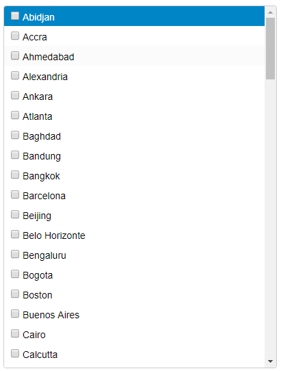
The above example binds the MultiSelectListBox to a list of string values. It can also be bound to a data table. When binding to a data table, set the DisplayMemberPath property of the MultiSelectListBox class to a field in the data table to display the list values.
Here is a sample code snippet for binding the MultiSelectListBox to a data table:
<c1-multi-select-list-box id="multiSelectList" display-member-path="ProductName">
    <c1-items-source source-collection="Model"></c1-items-source>
</c1-multi-select-list-box>
To fetch the checked values in the MultiSelectListBox, access the checkedItems property of the control's client-side API.
Refer to this link for more details.
Selection in the MultiSelectListBox Control
MultiSelectListBox lets users select items individually or collectively. Selecting individual items is referred to as Checkbox Selection. Selecting items collectively is referred to as Select All.
Checkbox Selection Option
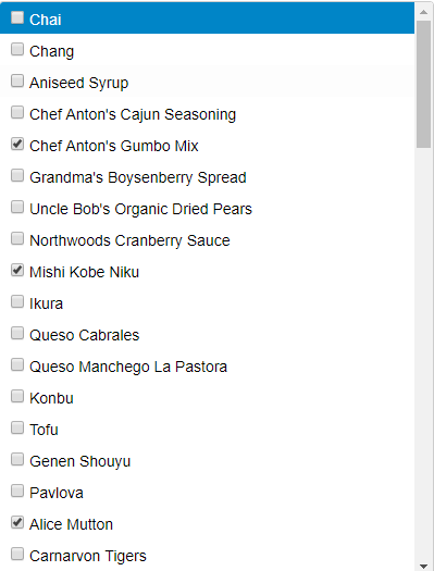
In checkbox selection, the user checks the checkbox of the corresponding item to select it. By default, a checkbox is displayed next to each item in the list. Bind the checkbox for each item to a data table field of type Boolean using the CheckedMemberPath property of the MultiSelectListBox class. Binding the list items checkbox to a field loads the MultiSelectListBox with selected and unselected list items. Whether they are selected or not depends on the value of the Boolean field.
Here is a sample code snippet setting the DisplayMemberPath and CheckedMemberPath properties to ProductName and Discontinued respectively:
<c1-multi-select-list-box id="multiSelectList" display-member-path="ProductName" checked-member-path="Discontinued">
  <c1-items-source source-collection="Model"></c1-items-source>
</c1-multi-select-list-box>
The image below depicts a MultiSelectListBox displaying the list of products with the CheckedMemberPath property set to the Discontinued field. A set of selected and unselected items populate the list.
Select All Option
Check the select all option displayed at the top of the list to select all the items at once. The select all option is not visible by default. To display the select all option, set the ShowSelectAllCheckbox property of MultiSelectListBox class to true.
Here is a sample code snippet setting the ShowSelectAllCheckbox property to true:
<c1-multi-select-list-box id="multiSelectList" display-member-path="ProductName" show-select-all-checkbox="true">
    <c1-items-source source-collection="Model"></c1-items-source>
</c1-multi-select-list-box>
The GIF depicts how the list items are selected once the user checks the select all option displayed at the top of the list.

Filtering in the MultiSelectListBox
Filtering helps narrow down the scope of data. It is a useful feature when working with large datasets and eases the selection process for the user. The MultiSelectListBox control features a filter input at the top of the list. When the user types a value into the filter input, it displays only those items containing the filter text and filters out the rest. The filter input is not displayed by default. Set the ShowFilterInput property of MultiSelectListBox class to "true" to indicate the filter input.
Here is a sample code snippet for setting the ShowFilterInput property to "true."
<c1-multi-select-list-box id="multiSelectList" display-member-path="ProductName" show-filter-input="true">
    <c1-items-source source-collection="Model"></c1-items-source>
</c1-multi-select-list-box>
The GIF below depicts filtering the list of items when 'la' is entered in the filter input.

The default placeholder text in the filter input is set to Filter. Change the placeholder by setting the FilterInputPlaceHolder property of the MultiSelectListBox class. As shown above, the filtered values are automatically selected after the filter operation is performed. The CheckOnFilter property of MultiSelectListBox class determines this behavior. By default, this property is set to "true," hence the filtered items are automatically selected. Setting the CheckOnFilter property to "false" restricts the selection.
The MultiSelectListBox control lets users select one, multiple, or all values in a list. It also offers a filtering option, ideal for large, complex datasets.
Let us know if you have any suggestions to enhance the control further.

Manpreet Kaur