What's New in ComponentOne Studio Enterprise 2018 v3
We're pleased to announce GrapeCity's final major release of 2018. Not only will you find great new chart and grid enhancements, but we've expanded our onboarding and customer experience.
Jump to your platform:
But first, the top news!
New Control in WPF: Simplified Ribbon
Improve the look and navigation of your WPF apps with the modern, minimalistic simplified ribbon! This new control occupies the middle ground between a ribbon a toolbar, providing a single-line collapsed state, or a three-line ribbon-like appearance, and its design is influenced by Microsoft's ever-evolving Office 365 ribbon.
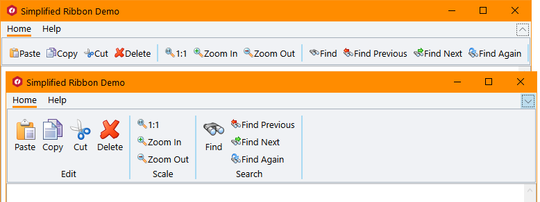
You can customize the style of the ribbon, as well as the buttons you'd like to include.
Introducing the WPF Simplified Ribbon Control - Tutorial
Read the blog about WPF Simplified Ribbon
New Control Designer for ASP.NET MVC
With our newly-enhanced scaffolders, you can use the control wizard to configure controls when you're not using Entity Framework and generate code for a C1 MVC control!

In addition to inserting a new control, this now supports updating an existing control definition using the wizard.
For example, if FlexGrid is declared in Razor view (as shown in the image), by placing the cursor within the definition and selecting “Update C1 Control” from context menu, you can set properties for that control and generate the required code. This feature is supported in ASP.NET MVC and ASP.NET Core MVC. This wizard can be invoked through the context menu or through Quick Actions in Razor view.
Learn more about the Control Wizard for ASP.NET MVC
WinForms Updates
New Material Theme Designer
In addition to adding Material, Material Dark, and Office 2016 Excel Green themes, WinForms now features a Material Theme Designer sample that allows you to set the primary and accent colours of Material theme and save\load them in C1themes format.

Learn more about the WinForms Material Theme Designer
New DataFilter control (beta)
A powerful UI addition, the DataFilter provides an easy, ecommerce-like filter to accompany any data-aware control. You can create filters from datasources, autogenerated, or create them manually. The accordion-based filtering UI can be attached to any control sharing a datasource or plugged into an info screen. The DataFilter is in beta mode and will be launched in 2019 v1.

Learn more about the DataFilter
New Sparkline control and FlexGrid integration
This lightweight sparkline chart control represents the general shape of data variation in a condensed visual. It's often embedded in grids, and as such, FlexGrid can now display sparklines in columns, and it's now easier to plot trends inside FlexGrid cells. The sparkline property of the FlexGrid column supports plotting line, column, and WinLoss sparklines.
You can further customize these sparklines by setting the Axis, markers, and series colours among others.

Learn more about sparkline | Learn more about FlexGrid sparkline integration
Additional enhancements
FlexGrid now supports SortDefinition and GroupDefinition, so grouping and sorting column information can now be saved and loaded.
Scheduler's table and agenda views are now launched and out of beta.
FlexChart now supports animation when loading, updating, and adding new data.
XAML Updates: WPF and UWP
In addition to the new WPF simplified ribbon control, WPF and UWP have several new features.
FlexGrid101 Samples
We’ve added a new C1Icon that enable a new level of customization for the sort, filter, and grouping glyphs, as well as FlexGrid101 samples to make it even easier to get started with our most popular control. The samples found in FlexGrid101 are meant to be the best place for developers to get started using out most popular control. They demonstrate features like selection, cell customization, conditional formatting, filtering, the RowDetails feature, cell merging, and many other points of interest.

C1Icon
C1Icon is a new object that we’re using within the FlexGrid to make it much easier to customize the many icons used throughout for sorting, filter, etc. C1Icon allows you to specify your own image, font character, or use a built-in template to change the appearance of the icons found in the data grid. Here's a look a the UWP C1Icon in action:

Scheduler
The new TableView Scheduler sample displays appointments in a table view that can be grouped, sorting, or filtered as specified by the developer or end user. It's similar to the Outlook 2016 List and Active views:

AgendaView displays appointments grouped by date in a table view where a single table row represents a single appointment. Users can edit appointments by double-clicking on an appointment and opening the EditAppointment dialog. This view is always sorted by dates in ascending order, and doesn’t have row or column headers.
We’ve also added a new “Working Elsewhere” appointment availability status:

FlexChart
We’ve added animations, performance improvements, legend scrolling, and many other enhancements to FlexChart in this release.
Animations
FlexChart now has animations for loading, updating, and changes to the chart axes. You can also create your own custom animations using the AnimationTransform event.

Financial Chart also includes these animations: WinForms | WPF | UWP
Ranged drawing mode
Ranged drawing mode allows support for built-in floating bar and Gantt charts. Ranged drawing mode is available for Bar, Column, and Area Charts.

New overlays in FinancialChart
FinancialChart includes two new overlays!
Alligator overlay
The Alligator overlay combines moving averages with fractal geometry and nonlinear dynamics. The jaw (red line), teeth (green line), and lips (blue line) of the Alligator show the interaction of different time periods. As clear trends can be seen only 15 to 30 per cent of the time, it is essential to follow them and refrain from working on markets that fluctuate only within certain price periods.

ZigZag overlay
Zig zag lines only appear when there is a price movement between a swing high and a swing low that is greater than a specified percentage (usually 5%).

Other Enhancements
UWP controls are now available through NuGet.
ASP.NET MVC Updates
In addition to the wizard (at top), we've added new enhancements to controls and a new demo.
New Flight Statistics Sample
This dashboard-style sample displays flight performance data over time. Controls include FlexGrid with sparkline columns for delay trend and KPI columns. A treemap, bar chart, and line symbol chart are used in to display region-wide statistics, and users can drill down to a specific region and city by selecting the data points.
On clicking a region in the Total Flights TreeMap, the FlexGrid displays the details of that region.

Try the Flight Statistics Demo
Group items in ComboBox
From the user request folder! With CollectionView already supporting grouping, ComboBox grouping could be implemented with some custom code, but we added this as a simple property in the control itself:

Learn more about ComboBox grouping
ActiveReports added to FlexViewer
In addition to FlexViewer's support for ActiveReports, a new Item Template allows you to quickly configure the viewer in your ASP.NET MVC app.

DashboardDemo updated with Material Design
Our popular DashboardDemo has been updated to include Material Design principles and color schemes. In addition, the DashboardLayout control has been added to the dashboard and analysis tabs.

FlexGrid Enhancements
Use ColumnGroupProvider to create multi-level merged-cell column headers for groups of related columns. This feature is available as a sample:

Use the AccessibilityExtender to easily extend accessibility support in one of two ways. This sample demonstrates how to extend accessibility in two ways:
- Resize columns using the keyboard (alt+left/right keys).
- Provide an "alert" method that changes the content of an invisible element with the role "alert." This allows assistive tools to announce grid actions like sorting and filtering.
See the full change log

Jody Handley