New Release! ComponentOne Studio Enterprise, 2018 v1
We're pleased to announce GrapeCity's first major release of 2018! In addition to a new control, you'll find multiple enhancements and templates that speed up your project creation and make ComponentOne's controls easier than ever to use.
Watch the video
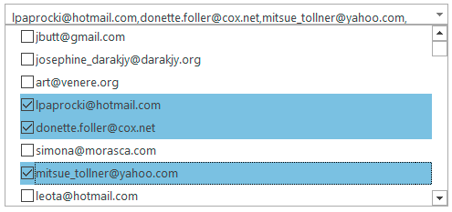
New Control: MultiSelect Input Control
Originally created for Wijmo JavaScript, MultiSelect is a drop-down control that extends ComboBox and adds checkboxes next to each item in the drop-down list, allowing users to select multiple items from a list. Read the blog | Documentation: WinForms | WPF
New Project Templates in WinForms, WPF, ASP.NET MVC
It's easier than ever to start using ComponentOne controls in your projects with these new project templates!
WinForms and WPF Visual Studio Templates vastly improve onboarding. When the user creates a new project using the template, they can select a theme for the project and style all the controls with the selected theme. Office 2016 themes were recently added for both platforms.
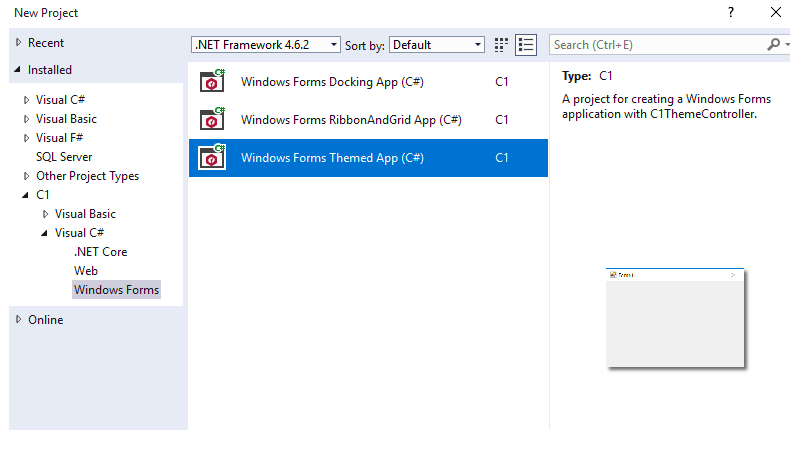
WinForms Project Templates | WPF Project Templates
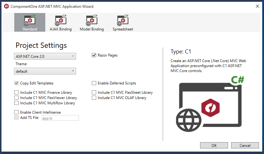
The new ASP.NET MVC Razor Pages template allows you to quickly create a preconfigured ComponentOne Razor Page applicaton in ASP.NET Core! All it take is a few clicks:
Read more about the ASP.NET Core MVC Razor Page Template
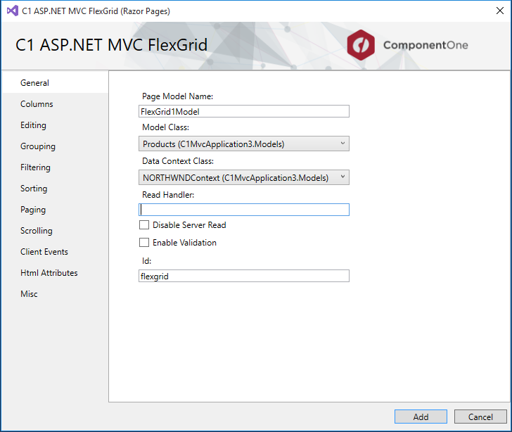
Exclusive to ComponentOne ASP.NET MVC: Razor Pages Scaffolder
Quickly generate screens for business apps using Scaffolders for Razor Pages. These scaffolders can add controls and model to a new RazorPage, and controls can be inserted into an existing page without writing a line of code.
In addition, ReportViewer and PDFViewer will both include item templates for RazorPages apps.
Execute Samples and Demos from the Integrated Desktop App
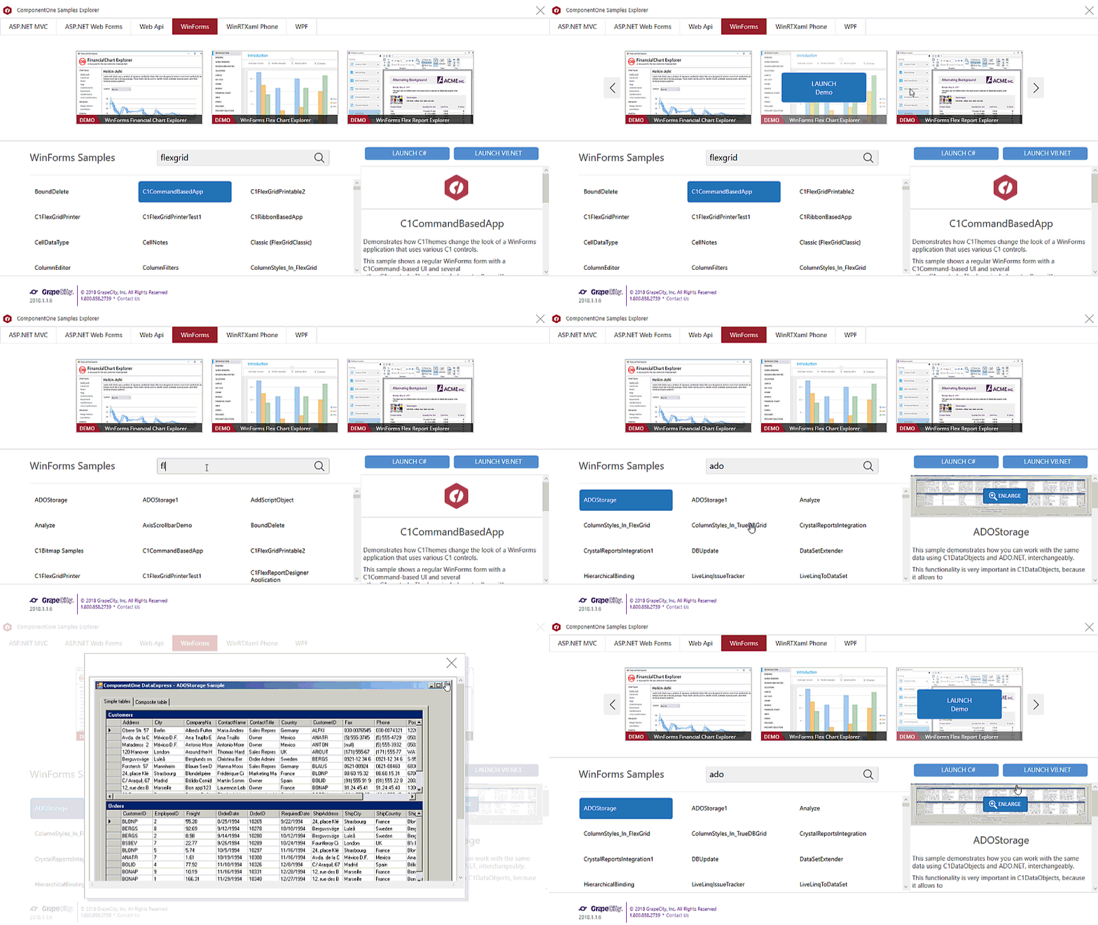
The new C1 Samples Explorer allows users to access samples and demos from a built-in desktop app. When the product installs, users get an additional icon to start up the Samples Explorer. Features allow users to browse and search samples across all platforms, and they can launch the VB or C# script from inside the app.
Data Visualization: New charts and features in FlexChart
FlexChart continues to expand in depth and breadth of feature offerings, with new charts and new interactions.
Axis Grouping
Increase the readability of your chart with axis grouping! In hierarchical data--for instance, quarters in a fiscal year--grouped axis labels makes it much easier for users to read and analyze the data.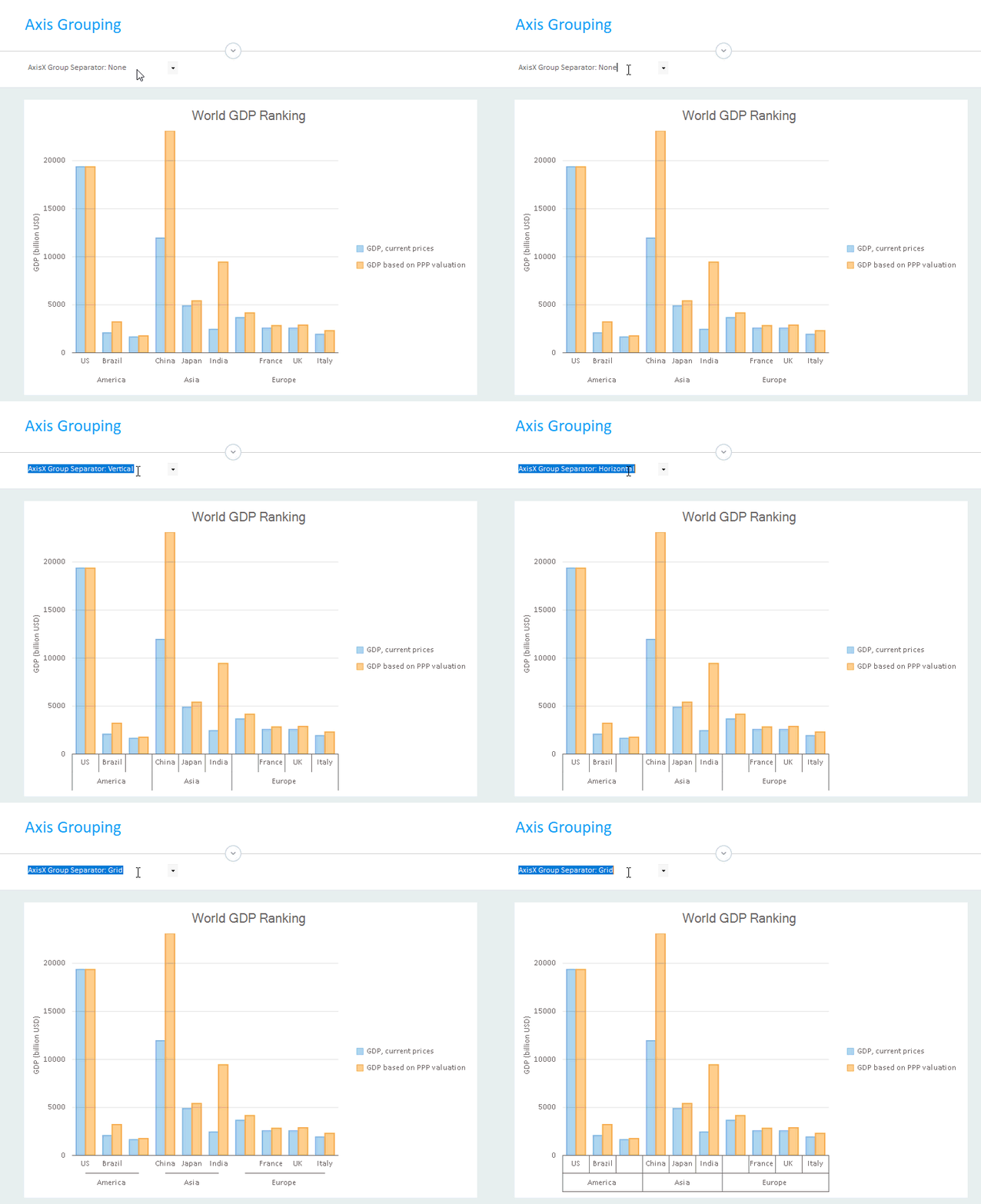
Documentation: WinForms | WPF | UWP
Managing Overlapping Labels
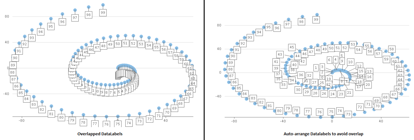
FlexChart now lets you manage overlapped data and axis labels for improved user experience. As you can see from the example below, auto-arranging of data labels can increase the readability of your charts and ensure that the user can see all the data.
Overlapping axis labels include several options like Auto, Show, Trim, and Word Wrap: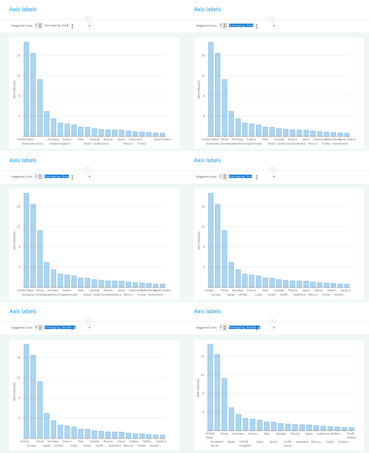
New Charts: Pareto, Point and Figure, and Gantt
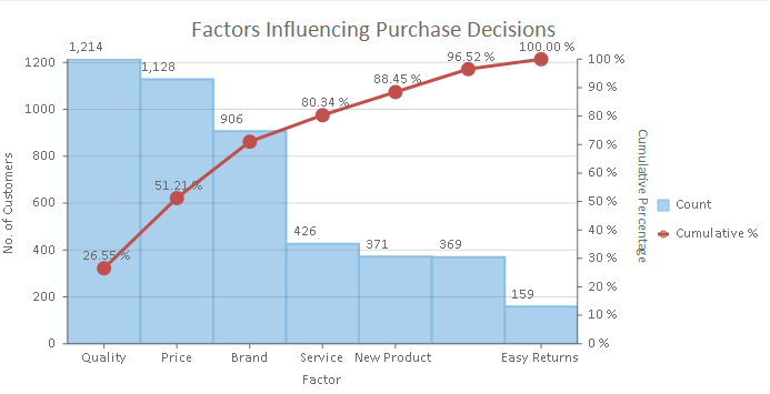
The new Pareto chart has been added as a sample to WinForms, WPF, and UWP. Pareto is a special histogram chart with columns in descending order and a rising line that represents cumulative total percentage. Pareto charts makes it easier to analyze most significant issues and prioritize corrective actions.
Point and Figure has been added to ASP.NET MVC FinancialChart, and MVC also features a GanttChart sample.
Dashboard Demo releases in ASP.NET MVC
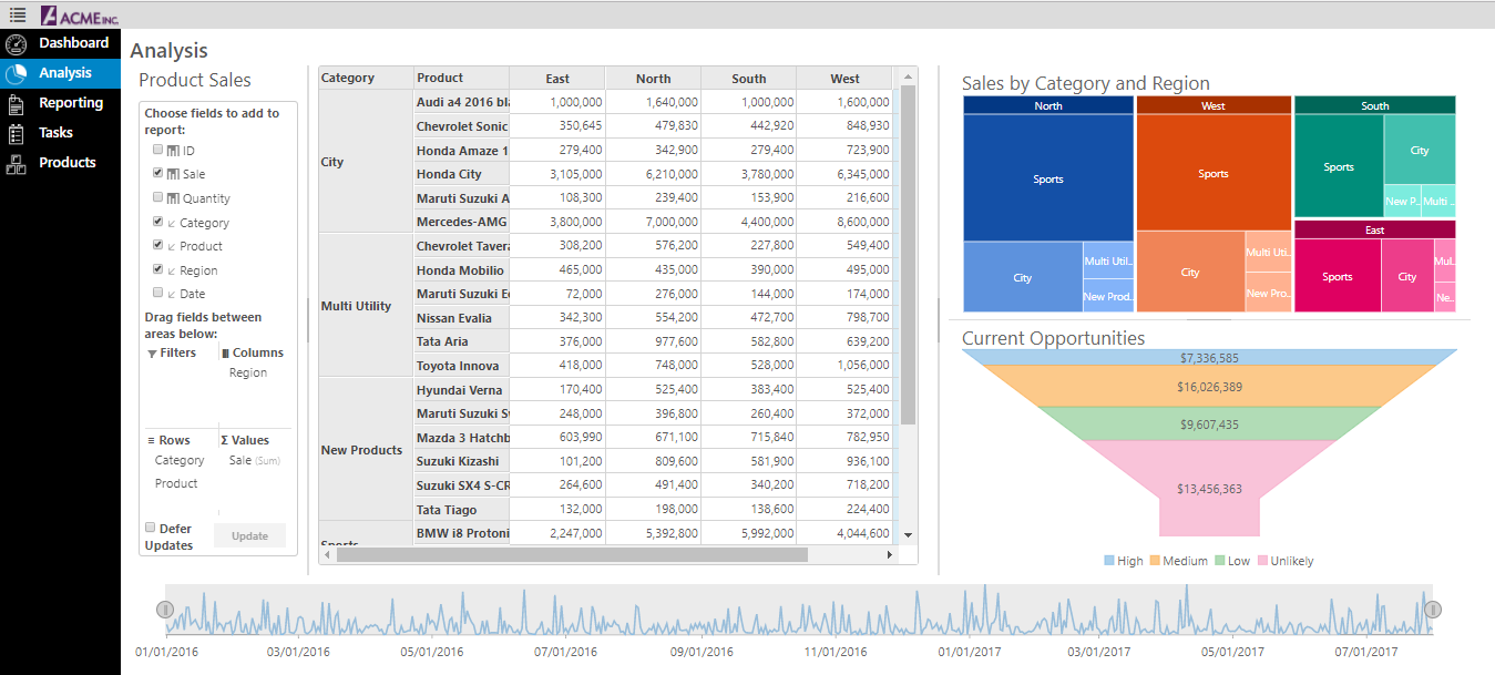
The Dashboard Demo, released in desktop in November 2017, is now available in ASP.NET MVC. Explore grids, charts, menus, pivot tables, reports, and more.
Get the demos: ASP.NET MVC
Here's the breakdown by platform.
WinForms
New Control: MultiSelect Input Control is a drop-down control that extends ComboBox and adds checkboxes next to each item in the drop-down list, allowing users to select multiple items from a list. Learn more
New Themed Project Template: Add a theme before you create your project. Office 2016 themes included! Learn more
The new C1 Samples Explorer allows users to access samples and demos from a built-in desktop app. When the product installs, users get an additional icon to start up the Samples Explorer. Features allow users to browse and search samples across all platforms, and they can launch the VB or C# script from inside the app. The explorer includes integration into Visual Studio.
New charts and features added to the FlexChart include Pareto chart, axis grouping, options for managing overlapping in axis and data labels, and custom legend icons. Learn more
In addition, you can now add expressions to column footers inusing Expression Editor.
TreeView
- Added integration with Expression Editor
- A search method has been added that can be used to search the TreeView
- Improved performance
- New events for editing
- Added selection properties for CustomContentPresenter
- Read more about TreeView
True DBGrid
- Added FooterExpression property for C1DataColumn
- Users can now add expression to column footers using Expression Editor
- Read more about True DBGrid
Expression Editor
- Added support of alias (DisplayNameAttribute) for fields
- Added support of BrowsableAttribute for fields
- Aggregate functions with one argument works for all items from DataSource
- Added the Round math function
- Added alphabetical order for the items of the categories selection
- Read more about Expression Editor
WPF
New Control: MultiSelect Input Control is a drop-down control that extends ComboBox and adds checkboxes next to each item in the drop-down list, allowing users to select multiple items from a list. Learn more
New Themed Project Template: Add a theme before you create your project. Office 2016 themes included! Learn more
The new C1 Samples Explorer allows users to access samples and demos from a built-in desktop app. When the product installs, users get an additional icon to start up the Samples Explorer. Features allow users to browse and search samples across all platforms, and they can launch the VB or C# script from inside the app. The explorer includes integration into Visual Studio.
New charts and features added to the FlexChart include Pareto chart, axis grouping, options for managing overlapping axis and data labels, and custom legend icons. Learn more
Scheduler
- Added new embedded themes for Office2010 Blue, Black, and Silver and Office2016 Colorful, White, Black, and DarkGray
- Default appearance changed to Office2016 Colorful theme
- Improved appointment layout algorithm for short appointments in views with a small visual scale
- Read more about WPF Scheduler
Expression Editor
- Added support of alias (DisplayNameAttribute) for fields
- Added support of BrowsableAttribute for fields
- Aggregate functions with one argument works for all items from DataSource
- Added the Round math function
- Added alphabetical order for the items of the categories selection
- Read more about Expression Editor
UWP
New Control: MultiSelect Input Control is a drop-down control that extends ComboBox and adds checkboxes next to each item in the drop-down list, allowing users to select multiple items from a list. Learn more
The new C1 Samples Explorer allows users to access samples and demos from a built-in desktop app. When the product installs, users get an additional icon to start up the Samples Explorer. Features allow users to browse and search samples across all platforms, and they can launch the VB or C# script from inside the app. The explorer includes integration into Visual Studio.
New charts and features added to the FlexChart include Pareto chart, axis grouping, options for managing overlapping axis and data labels, and custom legend icons. Learn more
Scheduler
- Improved appointment layout algorithm for short appointments in views with a small visual scale
- Read more about UWP Scheduler
Automation
- Fixed automation issues with FlexGrid, C1TabControl, C1CalendarControl, and C1TileView
- Added reference to C1.UWP.Automation to following samples: BasicLibrarySamples, CalendarSamples, FlexGridSamples, GaugeSamples, TileSamples, and TileViewSamples
Expression Editor
- Added support of alias (DisplayNameAttribute) for fields.
- Added support of BrowsableAttribute for fields.
- Aggregate functions with one argument works for all items from DataSource.
- Added the Round math function
- Added alphabetical order for the items of the categories selection
- Read more about Expression Editor
ASP.NET MVC
Razor Pages Scaffolder! Quickly generate screens for business apps using Scaffolders for Razor Pages. These scaffolders can add controls and model to a new RazorPage, and controls can be inserted into an existing page without writing a line of code! In addition, ReportViewer and PDFViewer will both include item templates for RazorPages apps. Learn more
New Project Template: Visual Studio Razor Pages App! Quickly create a preconfigured ComponentOne Razor Page applicaton in ASP.NET Core! All it take is a few clicks. Learn more
The server-side ODATA CollectionView binds MVC data-aware controls to ODATA services and supports server-side CRUD, sorting, filtering operations. Learn more
Dashboard Demo, released in desktop in November 2017, is now available in ASP.NET MVC. Explore grids, charts, menus, pivot tables, reports, and more. Try the demo.
Point and Figure is now available in the FinancialChart for ASP.NET MVC.
GanttChart is now available as a sample. Try the demo
Web API
- Improved search functionality in Reports
- Added Timeout property for SSRS reports.
Get the new release
Previous What's New
- 2017 V3 Release, November 2017
- 2017 V2 Release, July 2017
